Role
User Research, Interaction, Visual design, Prototyping & Testing
Platform
Desktop In-app, Web
Team
Solo designer, partnering with PM and engineering
Timeline
3 Months
Overview
The review loop was broken before it began
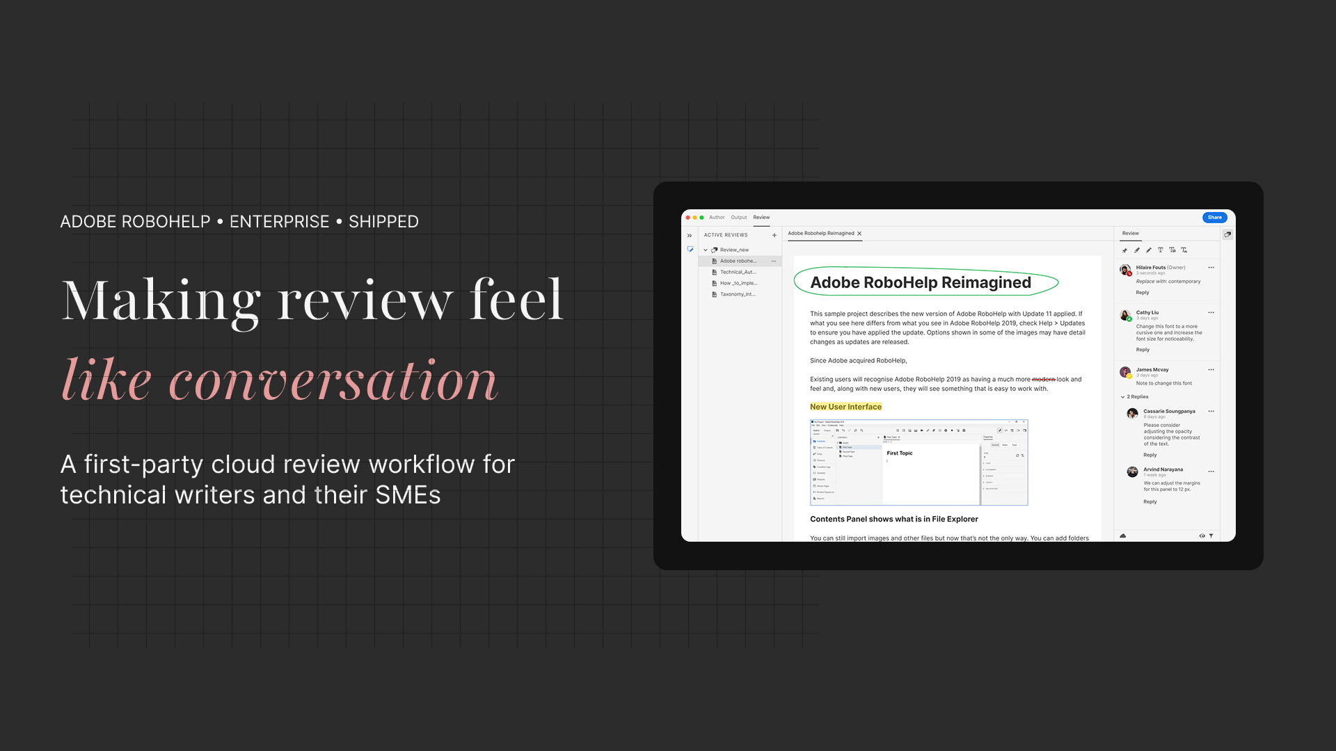
Technical writers working with Adobe RoboHelp managed content review through a patchwork of emails, PDF comments, and manual status tracking. Topics changed hands across asynchronous back-channels, leaving authors chasing feedback and reviewers unsure which version they were looking at.
The ask was clear: build a first-party review workflow into RoboHelp itself — one that an author could initiate in seconds and a subject matter expert could join from a browser link, no installation required.
3
ways to share: public link, invite, or password-protected
6
annotation tools: pin, highlight, strikethrough, insert, replace, draw
2
access modes: invite-only or anyone with the link, plus optional password
My contribution
End-to-end — from discovery to documentation
I owned the design of the Review feature across both surfaces: the author-side workflow within the RoboHelp desktop app, and the reviewer-side web experience that stakeholders accessed via shared link.
Beyond UX, I partnered with engineering to validate feasibility of real-time comment sync, defined edge-case states (empty reviews, expired links, password entry failures), and contributed to the Adobe Helpx documentation that now supports the feature.
What I delivered
• End-to-end UX for author workflow
• Reviewer web experience design
• Sharing + access control flows
• Annotation tool design
• Empty states & error handling
• Filter & settings panel
Design philosophy applied: Technical writers have high-stakes moments — the moment they send work out for review, and the moment a key stakeholder's comment could change the direction of a document. I designed for confidence at both ends.
Problem framing
Pain Point 1
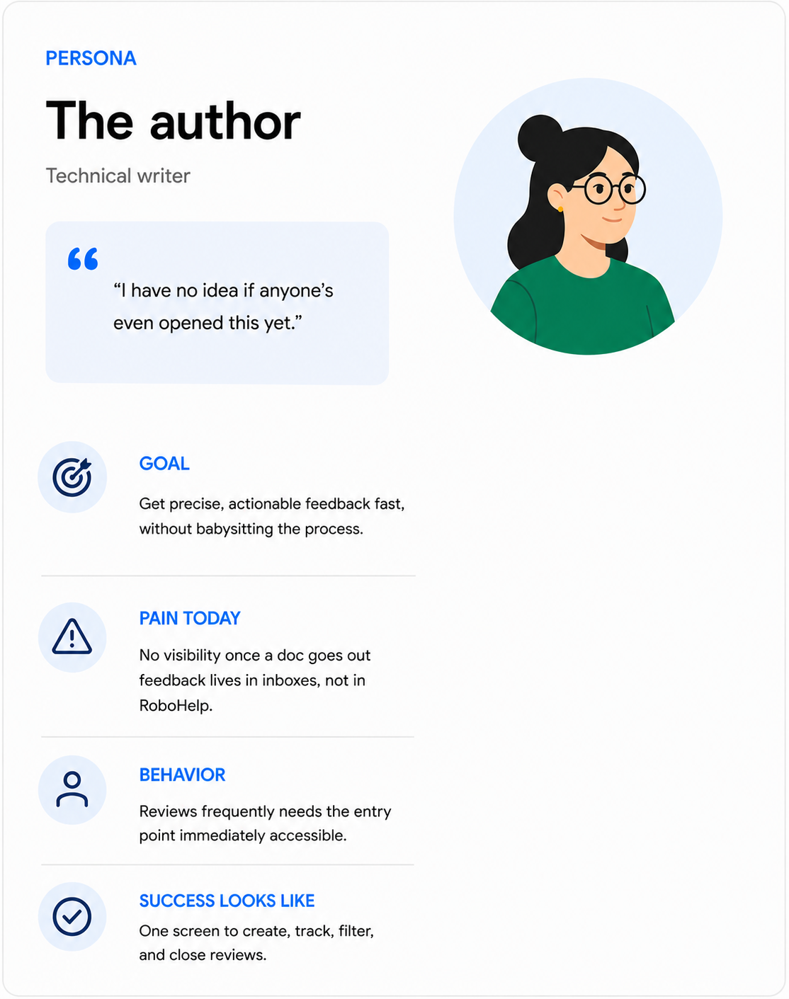
Authors had no visibility into review status
Once a document went out for review, authors had no way to know if it had been opened, who had commented, or when to follow up. Reviews lived in inboxes, not in RoboHelp.
Pain Point 2
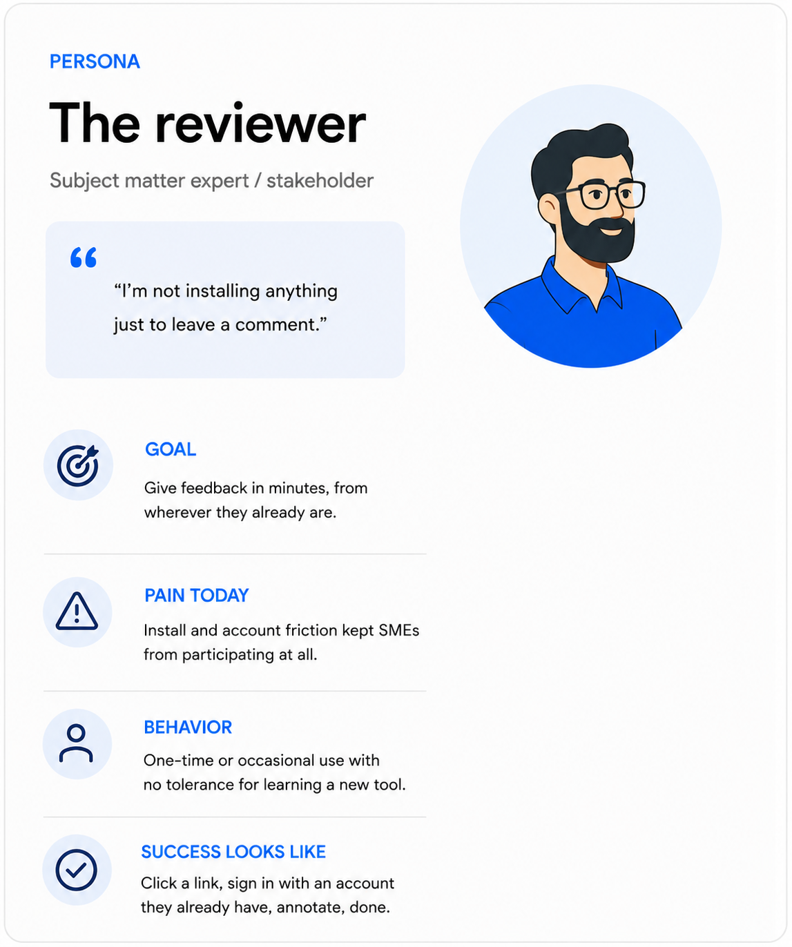
Reviewers needed an account or installed software
Inviting a subject matter expert — often outside the content team — required them to download software or navigate Adobe sign-in. Friction here meant fewer reviewers, fewer perspectives.
Pain Point 3
No structured way to propose text changes
Reviewers could highlight or add general comments, but there was no way to explicitly propose replacement text — a critical need for content that required precise wording.
Research & Discovery
How I got from complaints to a problem statement
Method: Informal discovery, conversations with internal stakeholders, plus review of existing complaint/feedback threads from the writer community.
Who I spoke with:
Product Managers and Directors: for business context and prioritisation signal
Subject Matter Experts and Evangelists: for how the review workflow actually broke down in practice
Existing complaint threads from technical writers using RoboHelp: to hear the pain in their own words, not filtered through a stakeholder's summary
What this surfaced:
Authors had no visibility into review status once a document went out
Reviewers were dropping off because installs/accounts were required
There was no structured way to propose specific text changes — feedback stayed vague
“The technical writer's job doesn't end when the draft is done, it begins again. The review loop is where accuracy is won or lost.”
— Research synthesis, conversations with RoboHelp power usersHow I Approached It
How I got from research to a shipped workflow
01
Discovery: shadowing the workaround
Reviews were happening in email and shared PDFs. The "active review" existed only in someone's head. I mapped the existing workflow end-to-end to locate exactly where handoffs broke down.
02
Two roles, one shared data layer
Authors create and manage. Reviewers consume and annotate via a browser link. I designed each surface independently, then unified them at the interaction layer. One constraint shaped everything on the author side: topics lock the moment a review is sent — no additions, no edits to scope. That single constraint made the selection step high-stakes and drove the need for a robust filter panel before committing.
03
Access control: flexibility over simplicity
An invite-only model failed one real use case — broad stakeholder sweeps where authors needed anyone-with-a-link access. The design: two named modes (Only Invited People Can Comment / Anyone With The Link Can Comment), with an optional password layer. The harder problem was the authentication gap: even public-link reviewers need an Adobe ID or social login. That's not frictionless. The design work was honest expectation-setting — invitation copy, login screen clarity, and empty state language — not just the UI mechanics.
04
Six annotation tools, zero ambiguous triggers
Pin, highlight, strikethrough, insert text, replace text, draw sha pe. Each had a distinct interaction model — strikethrough gates Submit until explanatory text is added; replace text applies a strikethrough to the selection and opens a replacement field. The sequencing challenge was preventing accidental triggers. The red color-picker visible during any annotation session served as a persistent mode signal.
05
Designing for a manual loop
At launch, reviewer edits couldn't be auto-applied to source. Authors had to switch modes and make changes manually. The design response: prioritise scannability in the comment panel. Each annotation type communicates intent at a glance. Resolve and Delete carry distinct consequences — Resolve hides a comment, Delete is permanent with a confirmation — because with no auto-sync fallback, the audit trail is the only safety net.
06
The Review list as a management surface
Four major iterations on the central screen. The shift that unlocked it: a configurable column panel (Topic, Status, Author, TOC, Folder, Last Modified) with filter by author, folder, and date. What started as an opaque list became a lightweight project management layer authors could shape to their process.
System design
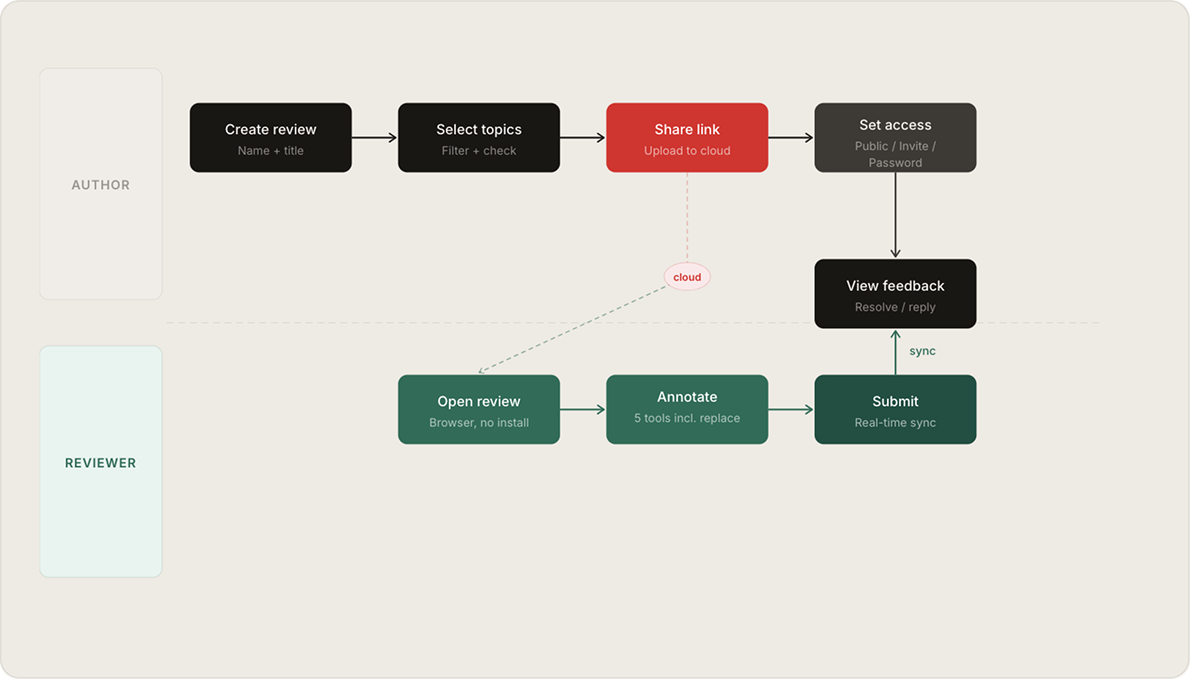
The review workflow, end-to-end
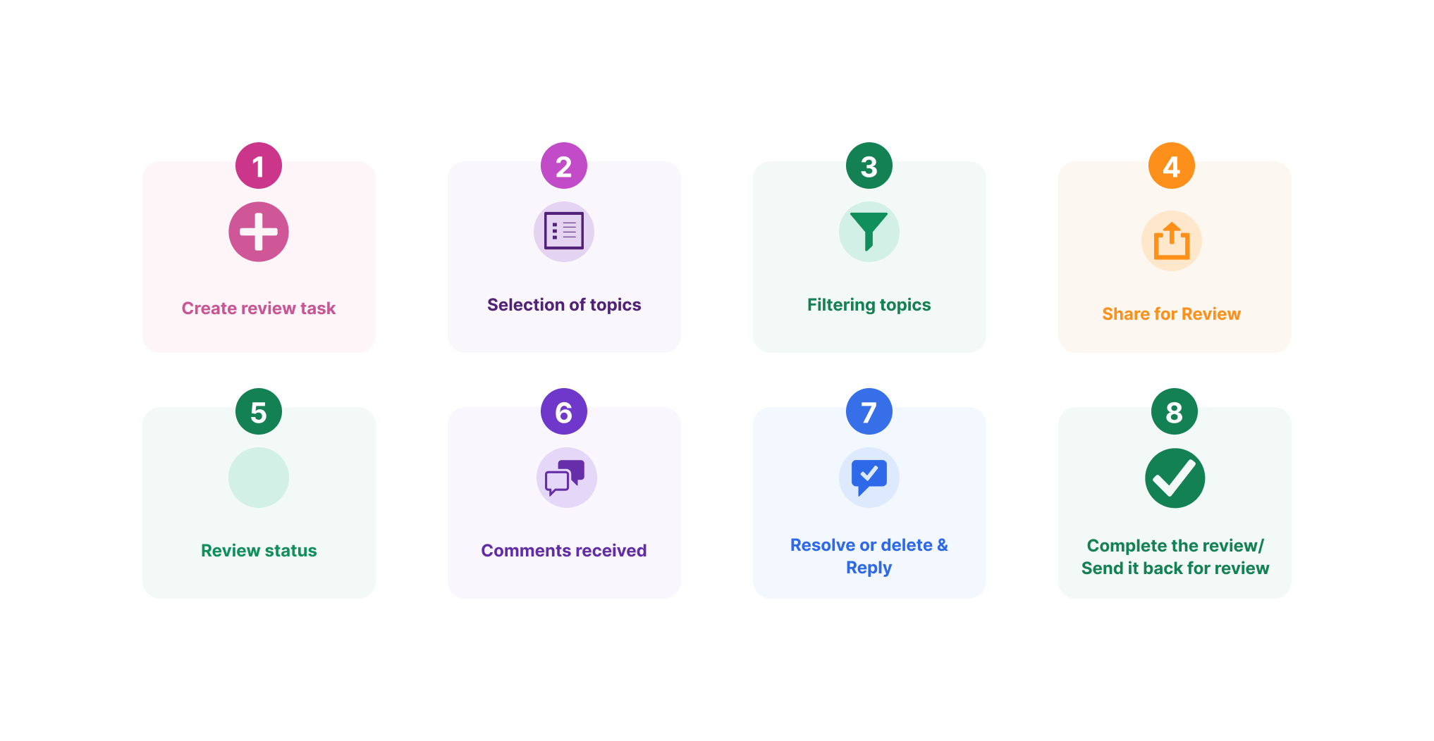
Two distinct roles, one shared review session. The author controls creation and sharing; reviewers operate entirely from a browser. Comments sync in real time between the web app and the author's RoboHelp desktop view.
Design Decisions
WHAT I REJECTED & WHY
DECISION
WHAT I CHOSE
Review creation entry point
1
Dedicated Review tab in the app header — always one click away, not buried in File or Tools menus. Authors who review frequently needed it immediately accessible.
A menu item under File > Share was intuitive for document sharing conventions but implied a one-time export rather than an ongoing managed review.
Topic selection model
2
Checkbox list with filter panel (author, TOC, folder, date). Lets authors scope a review to a subset of topics without navigating the full project tree. The topic-lock constraint — you cannot add topics after sending — made getting selection right the first time critical.
A drag-from-tree model felt more visual but required users to switch mental contexts between project management and review management.
Access control modes
3
Two named modes — Only Invited People Can Comment and Anyone With The Link Can Comment — with an optional password layer on the public mode. Access mode is set after link creation, not before, reducing up-front decision weight.
A single invite-only model was simpler but eliminated valid use cases. Three-mode up-front selection was tested but created paralysis — authors didn't know which mode they'd need until after the link existed.
Authentication expectation for public links
4
Honest onboarding: public link reviewers still need an Adobe ID, Google, Facebook, or Apple login. The reviewer login screen explains this clearly rather than dropping reviewers on an unexpected auth wall. Author-side invite copy was written to set this expectation before the link was shared.
This was a platform constraint, not a UX option. The design response was transparency, not elimination.
Comment resolution model
5
Resolve hides a comment (retrievable via filter); Delete is permanent and requires a confirmation warning. Two distinct actions with clearly different consequences.
A single "mark done" action conflated resolution (I've acted on this) with deletion (remove it). Given that reviewer edits must be applied manually by the author, the audit trail matters — resolved comments are frequently referenced again.
Reviewer identity
6
Display reviewers by name and avatar. Verified Adobe account holders receive a badge. Since the invite-only mode ties the review to specific email addresses, attribution is reliable.
Anonymous reviewing — without attribution, authors couldn't resolve competing feedback from multiple SMEs, and there was no accountability for who had or hadn't reviewed.
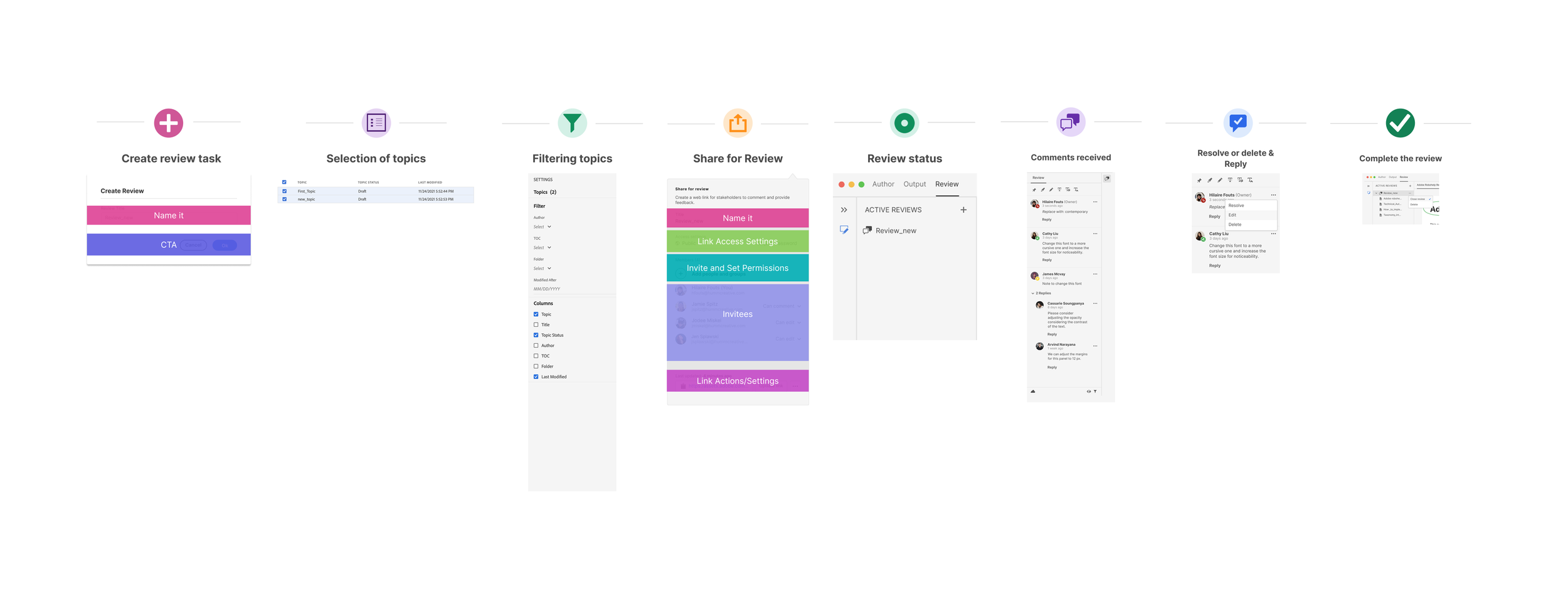
The share workflow
Key Screens in-app view for author
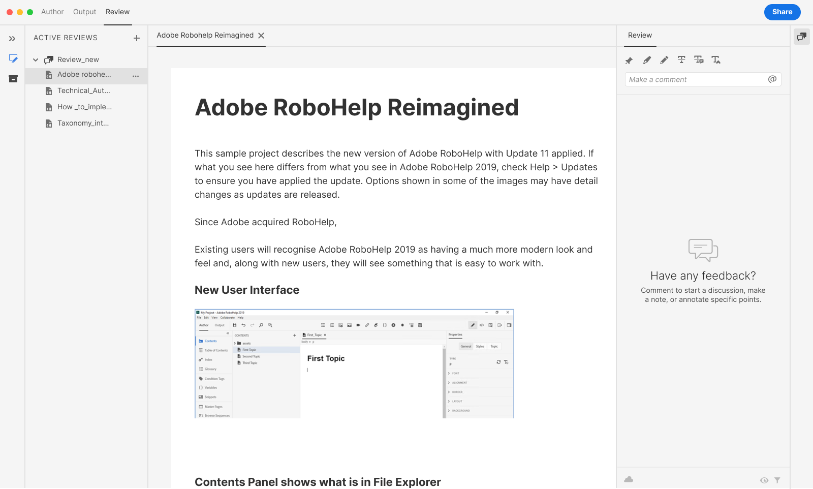
Empty comment panel
The author's review pane opens clean — no prior activity, just a comment field ready for the first note. This is the starting state before any reviewer has engaged with the document.
Title selected, annotation toolbar active
When the author selects text inside their own document, the same annotation toolbar reviewers use becomes available to them — pin, highlight, strikethrough, insert, replace. Authors can pre-annotate or respond in kind, using the identical toolset.
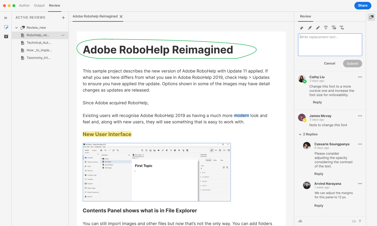
Replace-text input (filled — "Contemporary")
Submit only activates once text is entered — a small but deliberate guard against accidental empty submissions, consistent whether the author or a reviewer is the one filling the field.
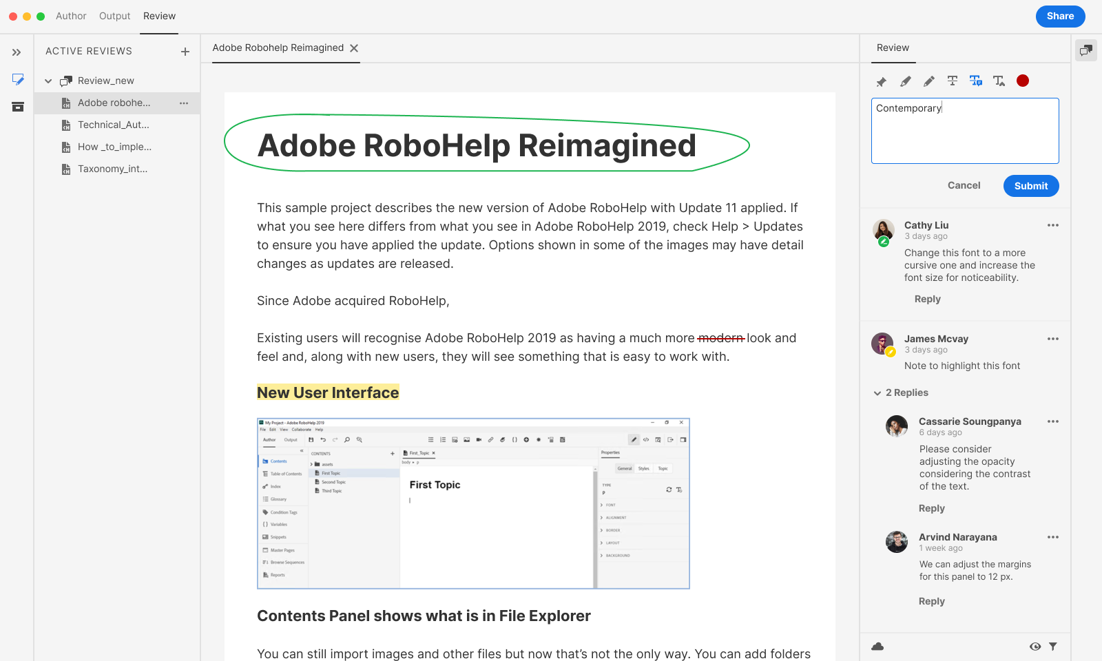
Author’s "Replace with" comment in thread
In the author's panel, "Replace with: contemporary" appears visually distinct from open comments — so when authors are working through feedback, structural suggestions don't blend into general discussion.
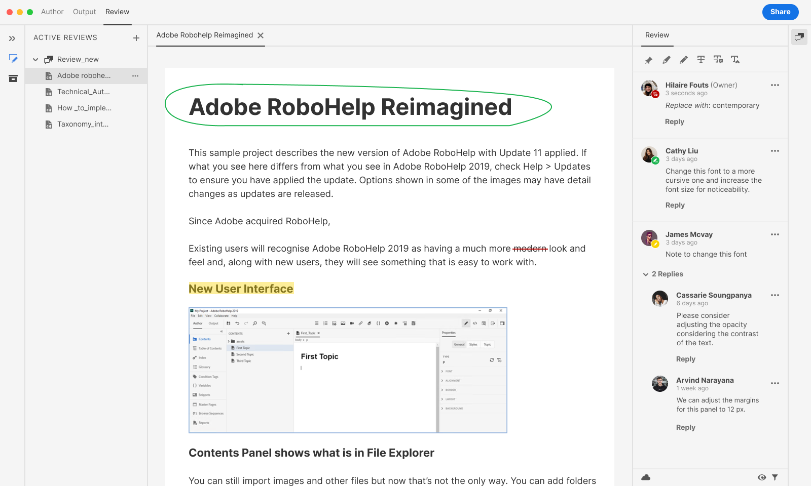
Comment options menu (Resolve / Edit / Delete)
This is the author's primary working tool: triage each comment with Resolve, Edit, or Delete. The three actions carry different weights — Resolve is reversible, Delete is not — giving authors confidence as they work through feedback at scale.
Filter panel — Reviewers, Time, Status
For documents with multiple reviewers, the author can narrow the panel to a specific person, time window, or resolution state before deciding what to act on next.
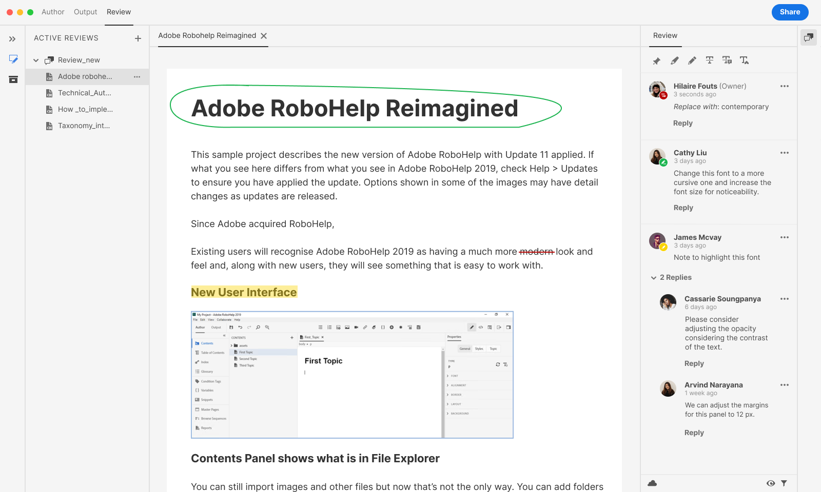
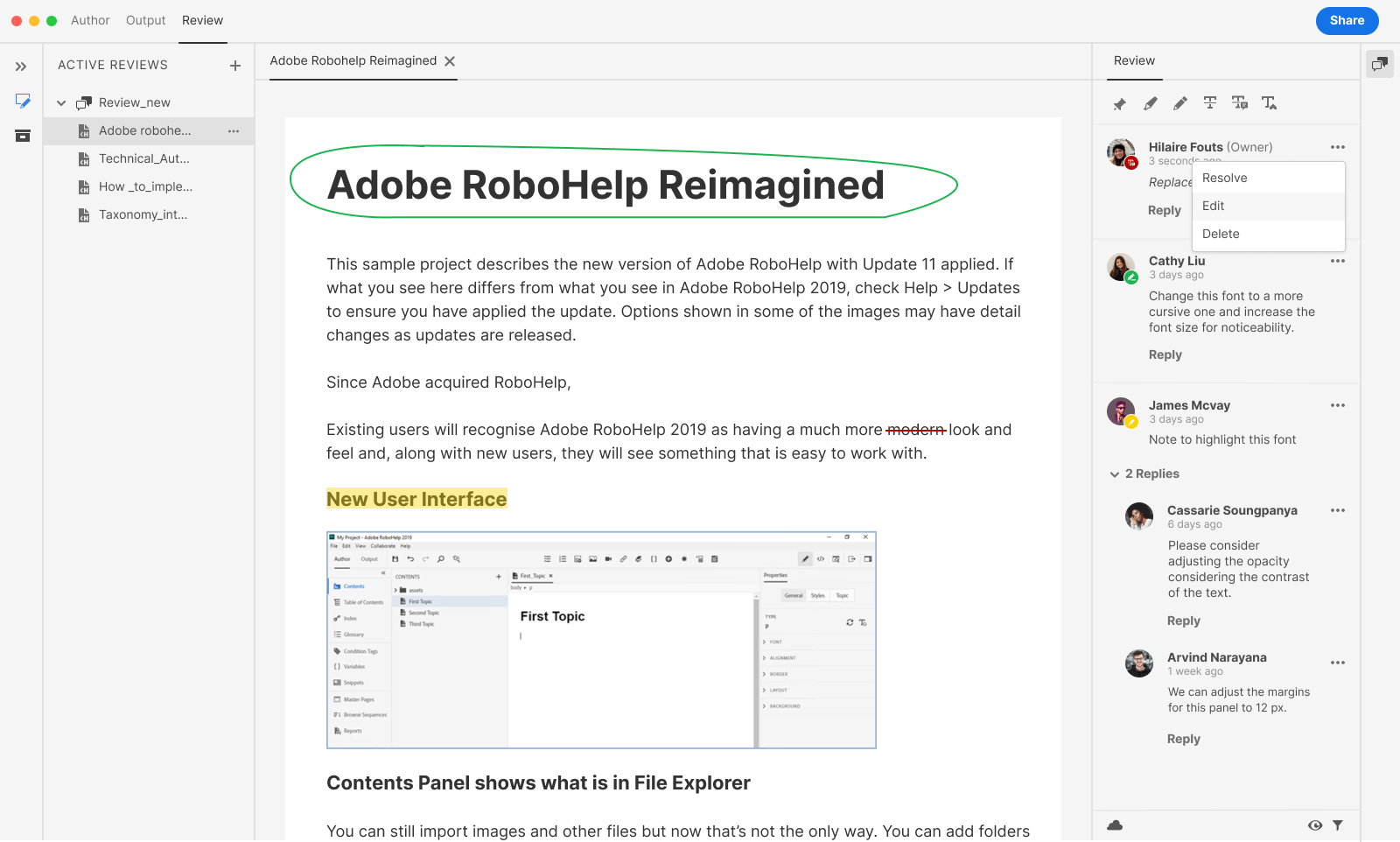
General comments with threaded replies
As reviewers respond, the author sees the full conversation collapse into threads within the same panel — no separate inbox, no switching context. Replies stay attached to the comment that prompted them.
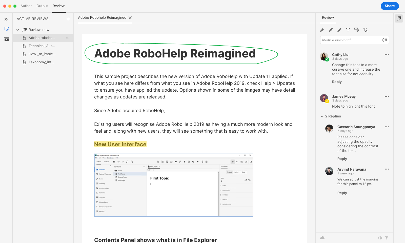
Filter panel — Apply state active
Selecting filters and hitting Apply updates the panel in place — no separate screen, no loss of document context. The author stays anchored in the content while reshaping what feedback they're looking at.
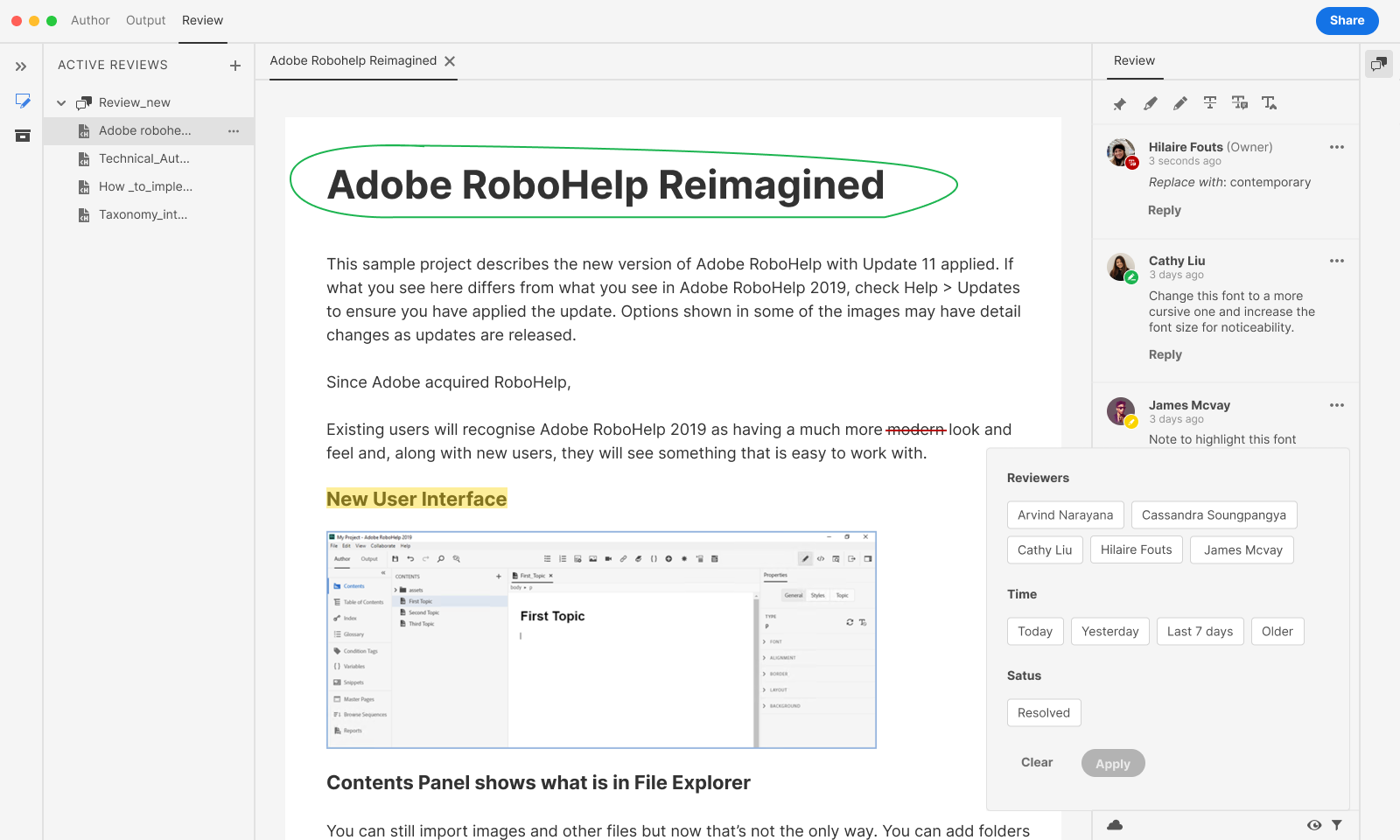
Filter applied
Based on the filters applied, the comment panel is filtered; in this case, the owner’s comments are not applied, so they don't appear in the comment panel, but they will still appear in the document.
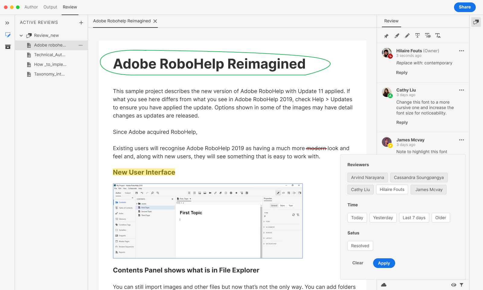
Close review menu (file tree)
The author controls the review's lifecycle from the same tree where they manage all their files — Close review is the deliberate, pre-selected default over the more destructive Delete.
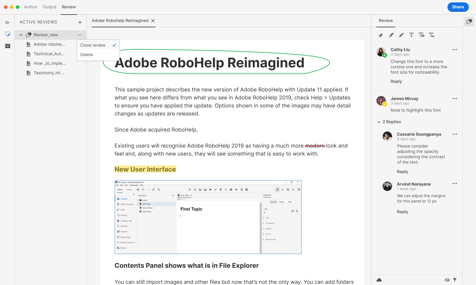
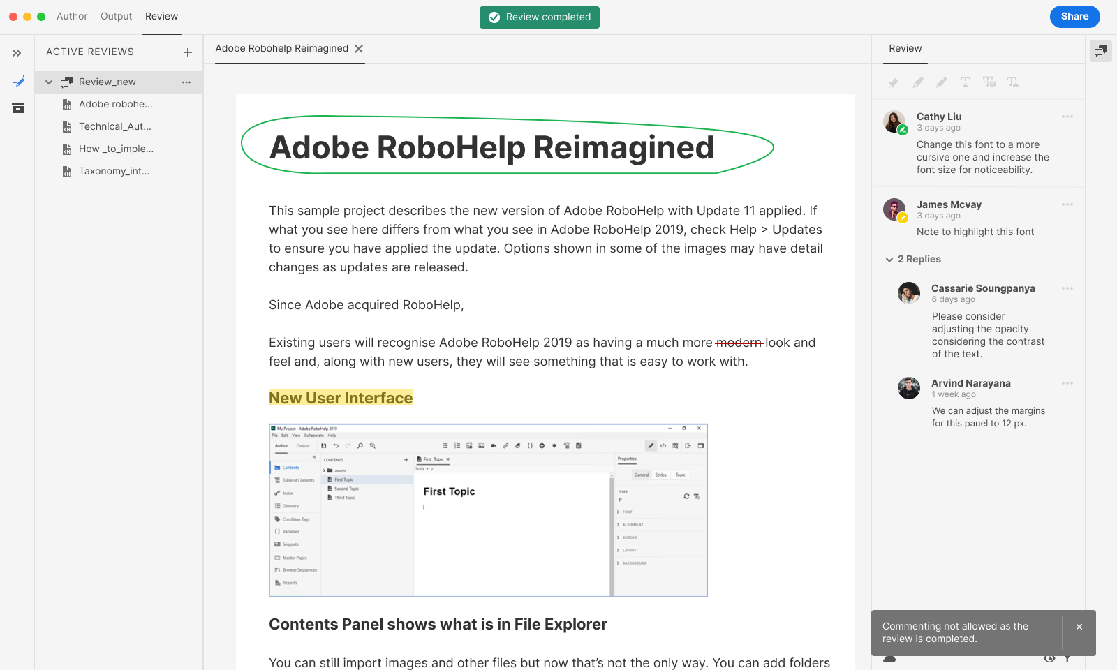
Review completed banner
Once the author closes the review, the interface locks commenting and surfaces a persistent confirmation banner. This is the author's signal — and everyone else's — that the review cycle is formally over.
Designing under constraint
What the feature couldn't do — and how that shaped what it could
CONSTRAINTS
1
Topics lock after sending
Once an author shares a review, no new topics can be added. Additional content requires starting a new review entirely. This was a cloud-sync architecture decision, not a UX one — but it landed in the UI as a potential frustration point.
Design response: make the filter panel prominent before selection. Authors need to feel confident in their topic list before committing. The Settings panel, with its multi-dimensional filtering (author, folder, TOC, modified date), addressed this by making the selection step feel comprehensive rather than rushed.
Reviewers must authenticate
2
Even for public reviews — anyone with the link — reviewers must sign in using an Adobe ID or an approved social login (Google, Facebook, Apple). Enterprise addresses must be registered against one of these systems. A reviewer who tries to log in with a plain corporate email that isn't linked to Adobe will be blocked.
Design response: transparency at every handoff point. The invitation copy needed to be explicit about the login requirement. The reviewer-facing login screen needed to explain the options clearly, including the path for first-time Adobe ID registration. Poorly set expectations here would create support load and reviewer drop-off — the design work was in the message, not the mechanism.
No auto-apply of reviewer edits
3
Reviewer suggestions — including precise "Replace with" text proposals — cannot be automatically written back to the source topic. Authors must switch from Review mode to Author mode, read each comment, and manually apply the change. This was a known v1 limitation; auto-apply was on the product roadmap.
Design response: lean into the comment panel as a work surface. The Resolve / Delete distinction became more important because authors needed a way to track what they'd acted on. Resolved comments are hidden but retrievable via filter — a decision audit trail. The "Replace with" annotation's structured format (strikethrough on original, proposed text below) was designed to be scannable at a glance, minimising the cognitive cost of the manual-apply loop.
Outcomes
What changed after shipping
The feature eliminated the most painful step in a technical writer's workflow: gathering structured feedback from distributed reviewers. Adoption and qualitative signals told the same story.
100%
adoption across active review workflows, replacing email and PDF entirely within the rollout window
0
software installs required — reviewers access through the browser; authentication via Adobe ID or social login
~70% fewer steps
for authors — review creation, topic selection, and sharing collapsed from a multi-app, multi-email process into one in-app flow
Reflections
What I'd do differently
What worked
The two-role model, author desktop, reviewer web — proved exactly right. Keeping the experiences separate but connected meant neither audience had to compromise. The comment panel design held up well: reviewers found it familiar enough to use without training, and authors could action in order without losing context.
What I'd change
The topic-lock constraint — no adding topics after sending — should have been surfaced more prominently at the selection stage. It appeared in documentation but not in the UI. A well-placed inline warning at the point of commitment ("Topics cannot be added after sharing") would have prevented frustration without adding friction to the default path.
The hardest constraint
Reviewer edits can't be automatically applied to source topics — authors must switch to Author mode and make changes manually. This wasn't a design choice; it was a platform limitation at launch. The design response was to make the comment panel as scannable as possible and give Resolve and Delete distinct, clearly-consequenced affordances. Future versions planned auto-apply functionality — designing for that graceful upgrade was part of the brief.
What I'd explore next
When auto-apply does ship, the design challenge flips: from "how does the author find and act on feedback manually" to "how does the author review and approve proposed changes before they're written back to source." That's a meaningful interaction problem — closer to a tracked-changes model — and the current comment panel would need to evolve to support it.