Role
UX Strategy, Systems Design, Stakeholder Research
Team
Web (Desktop-first)
Project Type
Enterprise Product Design
Timeline
December 2023 - March 2024
Platflorm
Web (Desktop-first)
Project Type
Enterprise Product Design
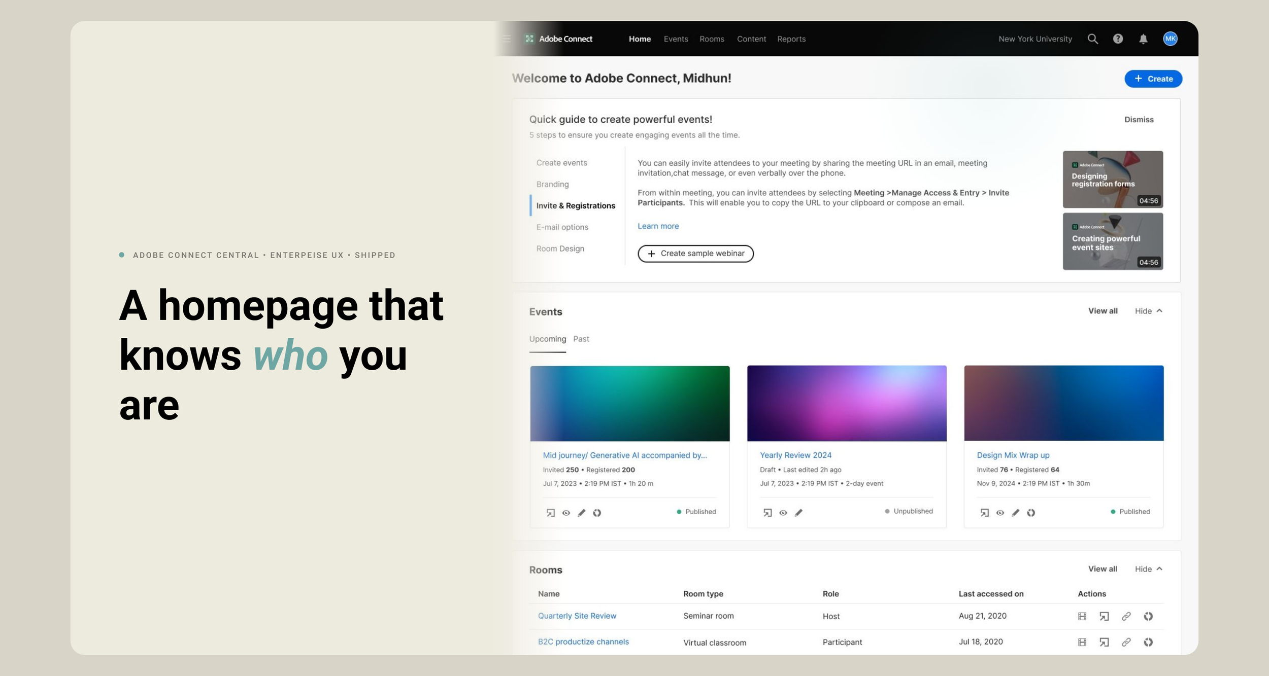
Led the redesign of Adobe Connect Central’s homepage, transforming a legacy utility dashboard into a modern enterprise landing experience aligned with Adobe’s evolving product ecosystem.
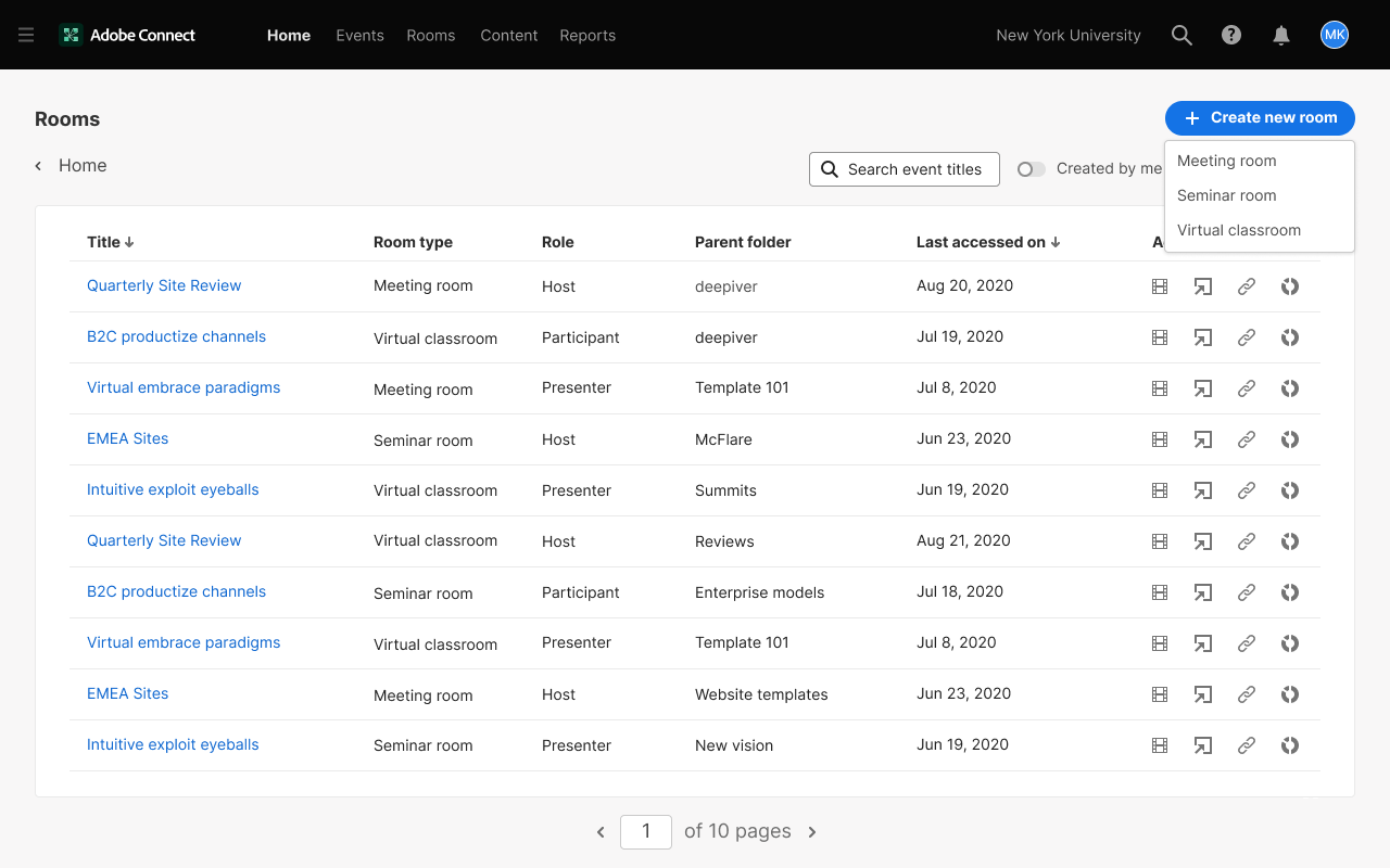
Overview
Adobe Connect's homepage needed to work harder for a wide spectrum of users, from first-time licensees who had never created a room, to power users managing a full calendar of events, rooms, and recordings. The challenge wasn't just visual; it was fundamentally about relevance. A single static layout served everyone the same experience regardless of license type, activity history, or intent, leaving some users overwhelmed and others facing an empty screen with no clear next step.
The Design Problem
Every Adobe Connect user — first-time licensee or power user — landed on the same static homepage. No first action for new users. No relevance for lapsed or rooms-only users, who saw features they couldn't access ahead of the ones they actually used. The homepage was supposed to be the product's front door. It was no one's.
7
Use cases mapped
3
Key variables
5
Research phases
1
Shippped product
No personalisation engine existed. Had to be a rules-based adaptive system, license type, activity recency, widget item counts as inputs, deterministic enough for engineering to build without a recommendation model behind it.
The constraint
Stakeholder alignment
Before moving into wireframes, I facilitated a cross-functional design review with product, engineering, and stakeholders to align on foundational decisions that would directly shape the homepage architecture.
Default state for new users
1
Defined explicitly — no behavioral data to fall back on
Filters
2
Scoped per widget, not global
Scroll depth
3
Capped per widget, consistent across screen sizes
Customize scope
4
Reorder only (pushed for this — protected timeline; show/hide flagged as fast-follow)
Decision
Resolved as
Pin/favorite
5
Deferred
Why it mattered : locked early, so fundamentals weren't re-litigated mid-design.
Discovery
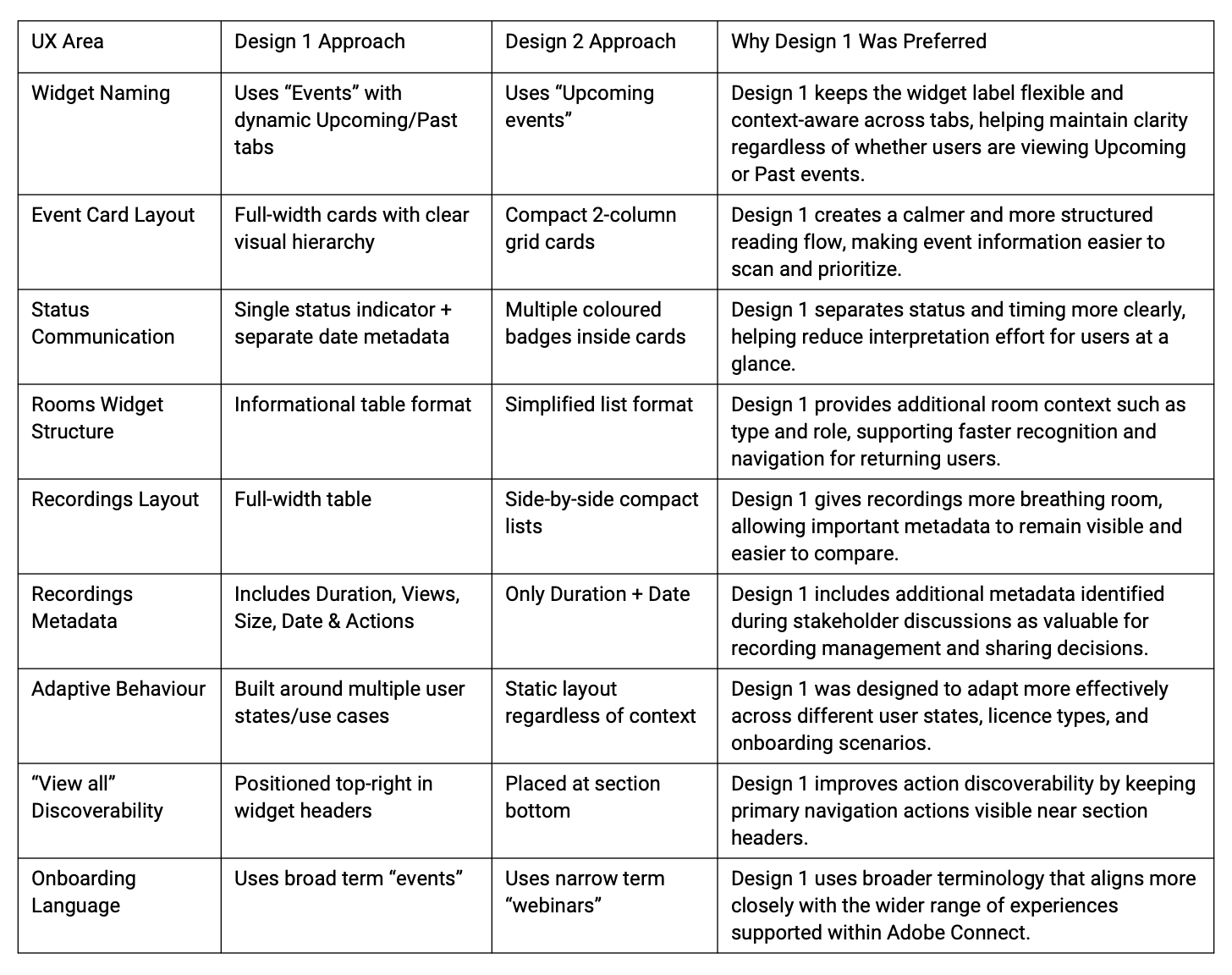
Audit found
Widget hierarchy static — zero adaptation to license, activity, or state
Rooms/Recordings widgets are missing critical columns (type, role, views, file size)
Event cards stacked two status badges per card → ambiguity between timing and publish state
Onboarding copy said "webinars" platform-wide → misrepresented a product covering meetings + classrooms too
"View all" is buried below the fold in every widget
Stakeholder interviews → core diagnosis: the homepage was designed for a generic user who didn't exist in the data
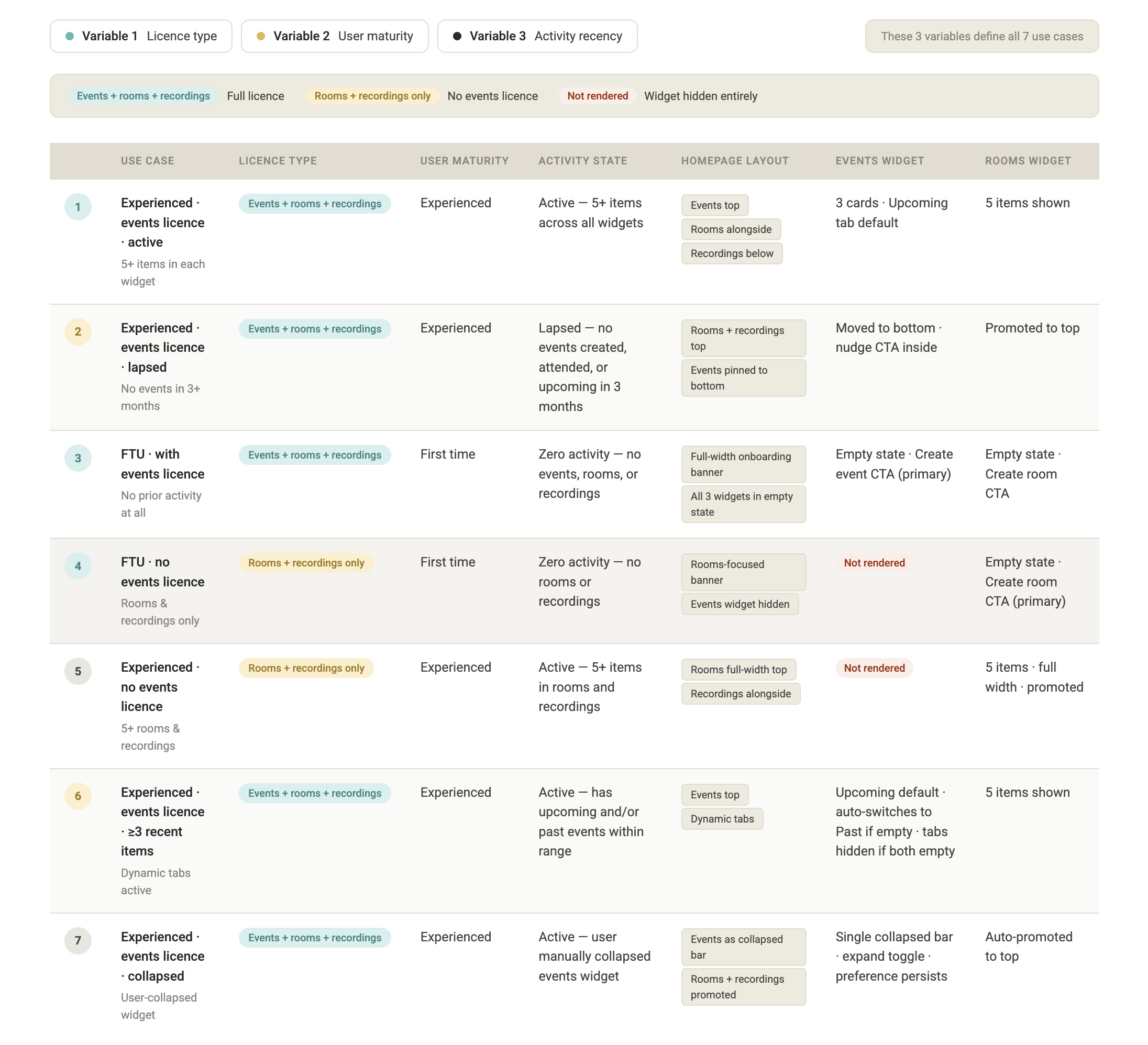
Synthesis → 7 user states, from 3 variables
License type
Events vs. Rooms & Recordings only
7 Usecases
✳︎
Adaptive Widget Hierarchy
✳︎
FTU Onboarding
✳︎
Events Dynamic Tabs
✳︎
Room View All Experience
7 Usecases ✳︎ Adaptive Widget Hierarchy ✳︎ FTU Onboarding ✳︎ Events Dynamic Tabs ✳︎ Room View All Experience
Maturity
First-time vs. experienced
Activity recency
Active / lapsed (3+ months) / dormant
Old design audit
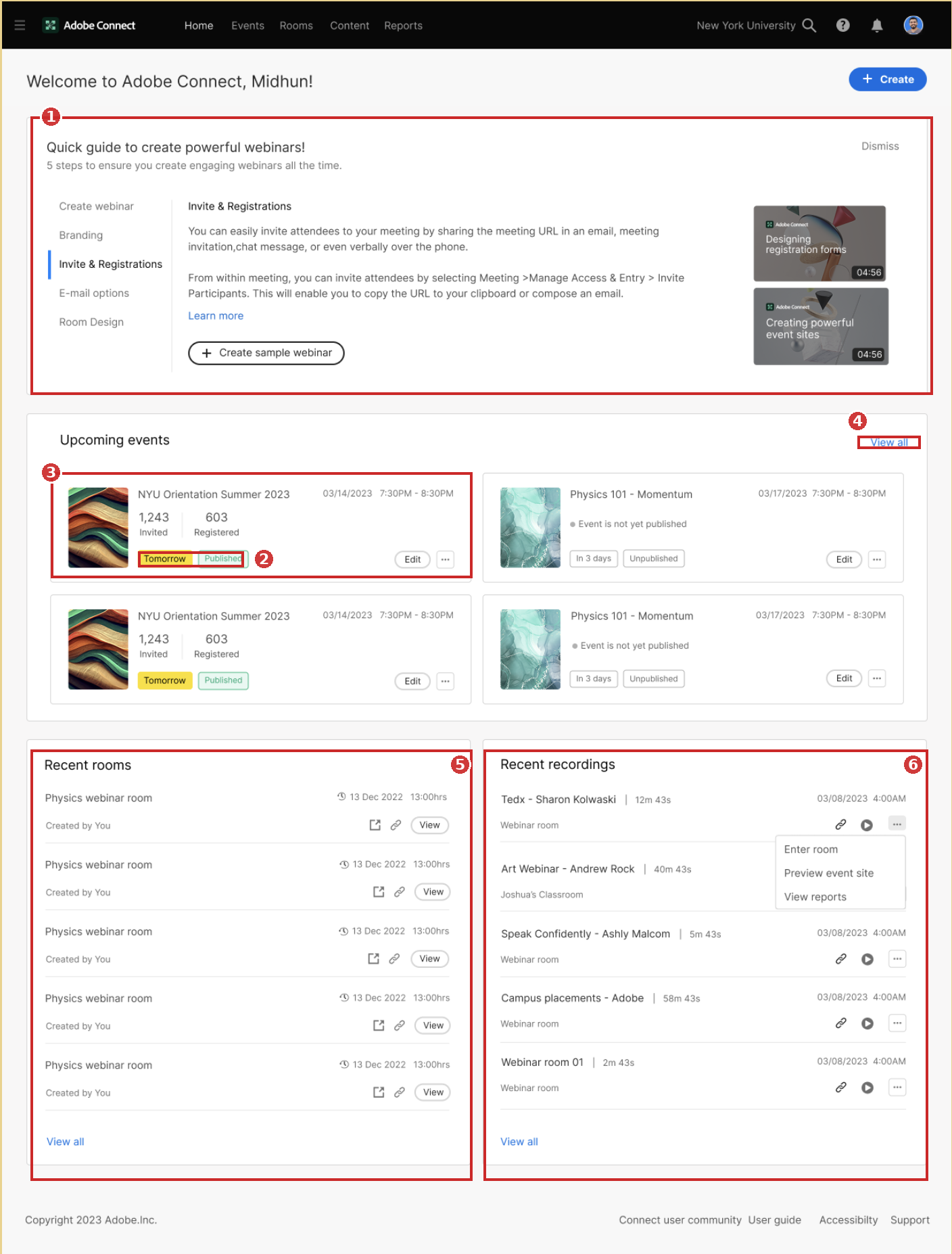
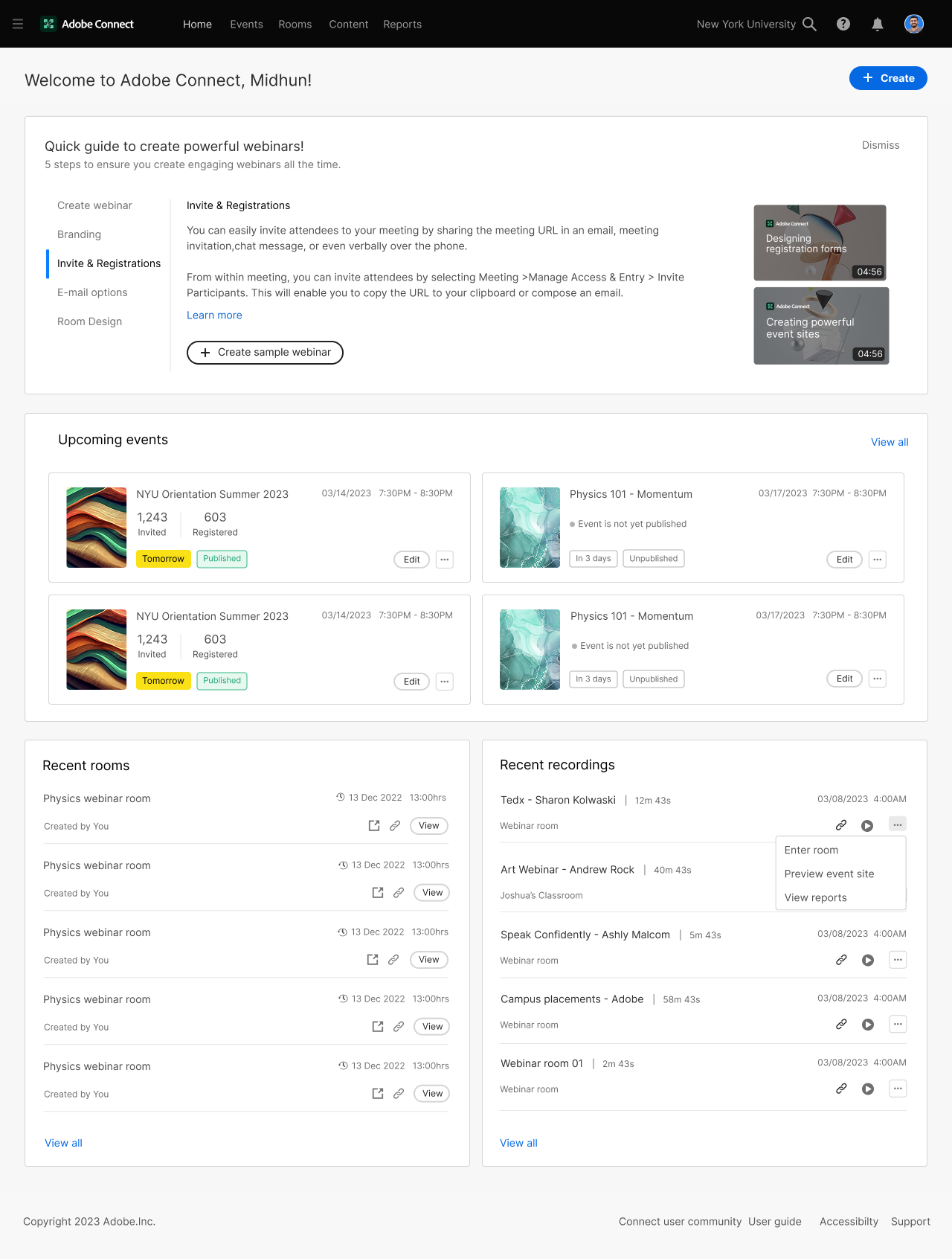
1 — Onboarding copy doesn't match the platform. The guide says "create powerful webinars" — but Adobe Connect covers meetings, virtual classrooms, and seminars too. A rooms-only licensee sees onboarding for a feature they don't have access to. This is the exact gap your case study calls out: FTU copy isn't licence-aware.
2 — Double badges create ambiguous status. "Tomorrow" (temporal) and "Published" (publish state) sit side by side at equal visual weight, on equal-colored pills. A user has to parse two unrelated taxonomies in one glance with no visual grouping to say these mean different things.
3 — No hierarchy inside the event card. Thumbnail, title, date range, invited/registered counts, and badges all compete at the same weight. Nothing tells the eye what matters first — is it the date, the registration count, or the status?
4 — "View all" is a low-affordance, easy-to-miss text link. It's small, low contrast, and tucked top-right of the section — your audit notes this same pattern recurring at the bottom of Recent rooms/Recordings too, forcing a scroll past everything just to find it.
5 — Recent rooms is undifferentiated. Five identical "Physics webinar room" entries, same timestamp, same "Created by You" — no room type, no role, nothing to distinguish one from another. This is the missing-metadata gap your audit flags directly.
6 — Recent recordings is missing the columns that matter. No file size, no view count — just title and duration. For a power user managing dozens of recordings, there's no way to gauge engagement or storage at a glance.
The structural issue underneath all six: none of this adapts. Whether you're the first-time licensee staring at an empty dashboard or a power user with a full calendar, you get the same fixed grid — which is the core "one-size-fits-all" framing your case study is built around solving with the 7-state adaptive hierarchy.
My Role & Responsibilities
Lead & sole UX designer - Owned the design end-to-end from problem framing through to shipped product.
PM & engineering collaboration - Worked closely with PM and engineering throughout, translating product requirements into design decisions.
Design reviews - Led cross-functional design reviews with stakeholders across product, engineering, and other teams.
Problem definition - Drove the core brief from a clear pain point; the homepage was entirely redundant across user types.
Design system adherence - Used Adobe XD for specs, adhering to React Spectrum CSS guidelines and Adobe's Spectrum component library
Shipped product - Delivered a fully shipped product; the redesigned homepage replaced the previous one-size-fits-all experience
Use cases and user journey mapping
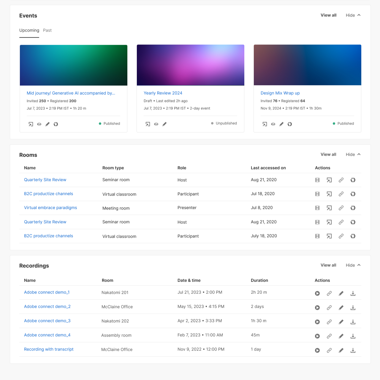
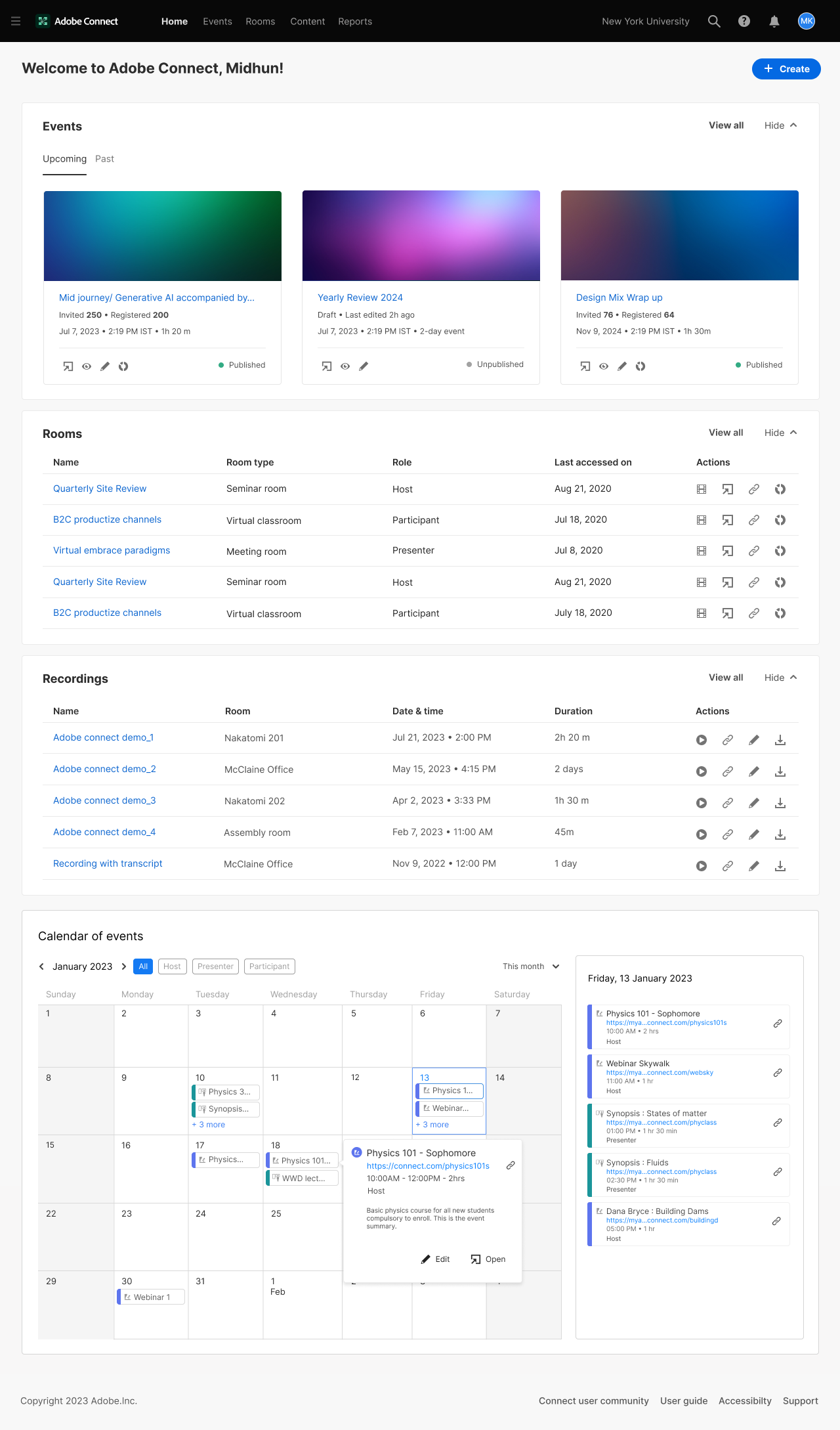
Homepage
For active licensed users with 5 or more items across widgets, the Events widget surfaces 3 cards and the Rooms widget shows 5 items, keeping the homepage scannable without requiring scroll.
Experienced · Events licence · Lapsed (3+ months)
Licensed users with Events access who have not created any events, do not have any upcoming events, and have not attended any events in the past 3 months.
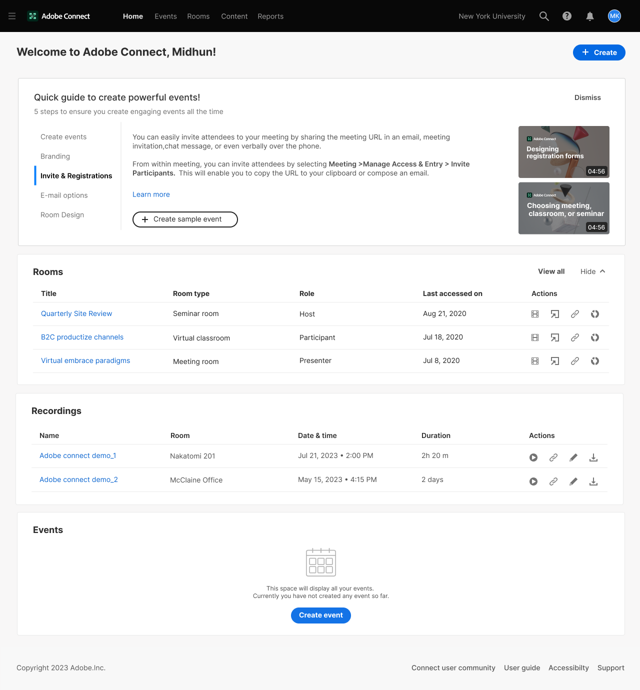
Lapsed events user • events widget deprioritised
For licensed users with Events access who have not created or attended any events in the past 3 months and do not have any upcoming events, the Events widget will be placed at the bottom of the homepage.
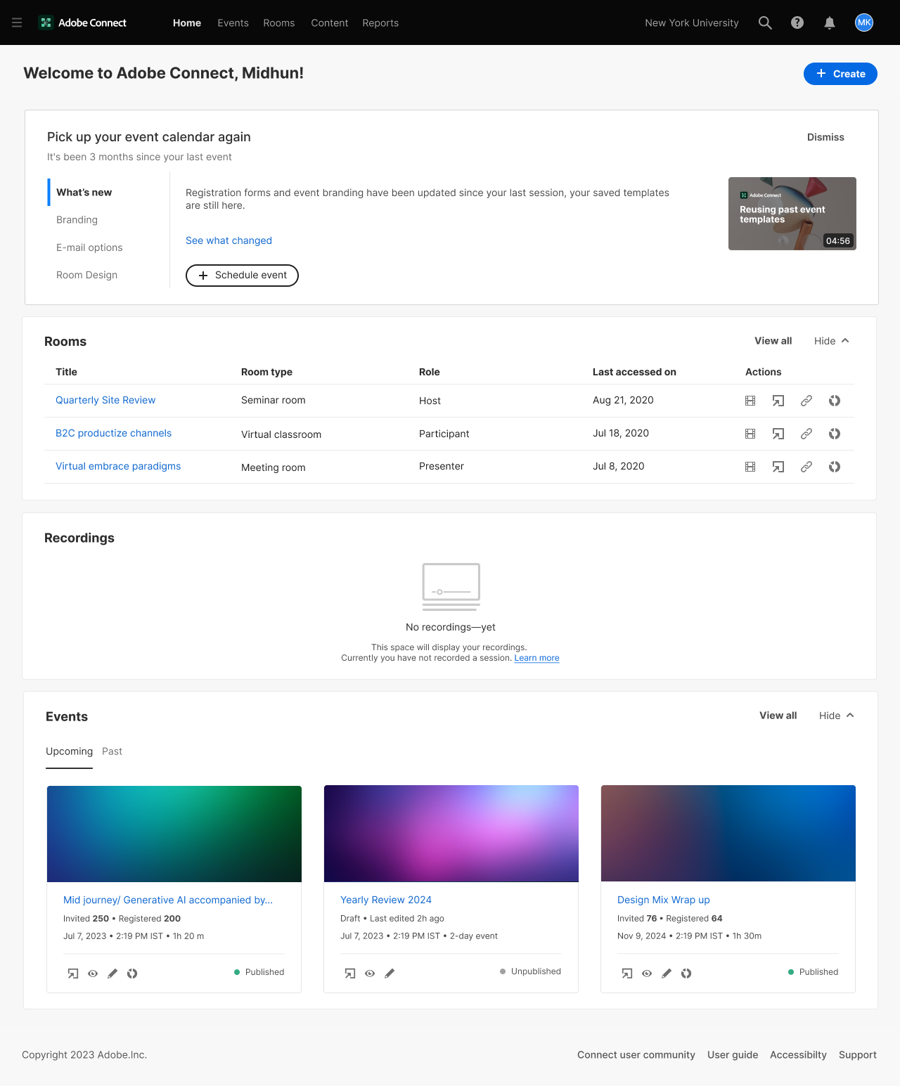
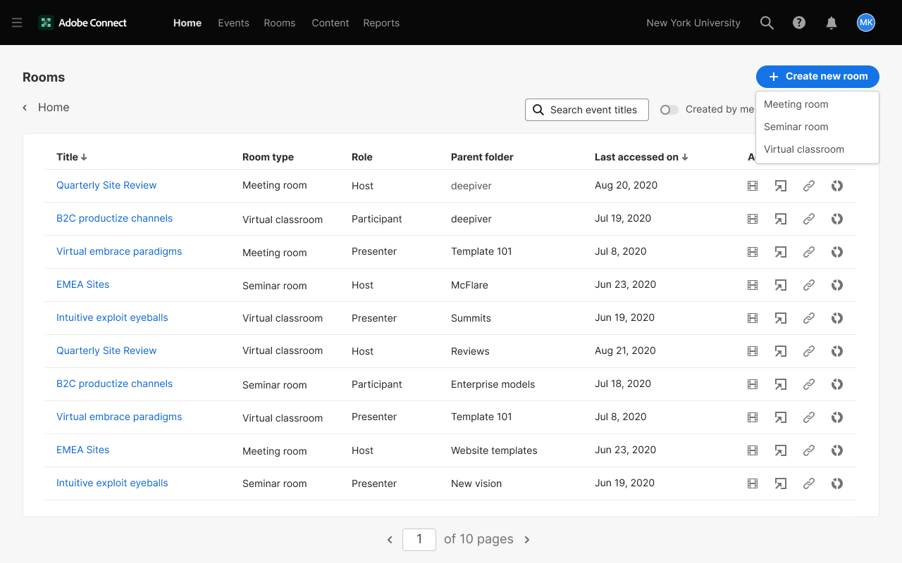
Room filters - type & role, all selected by default
Filters for Room Type and Role will be available at the top, with all rooms selected by default.
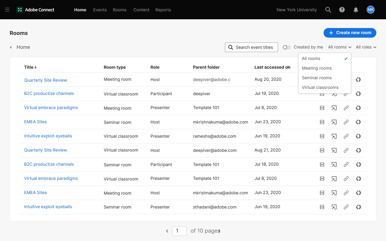
Room filters
Only Meeting Rooms selected in the filters.
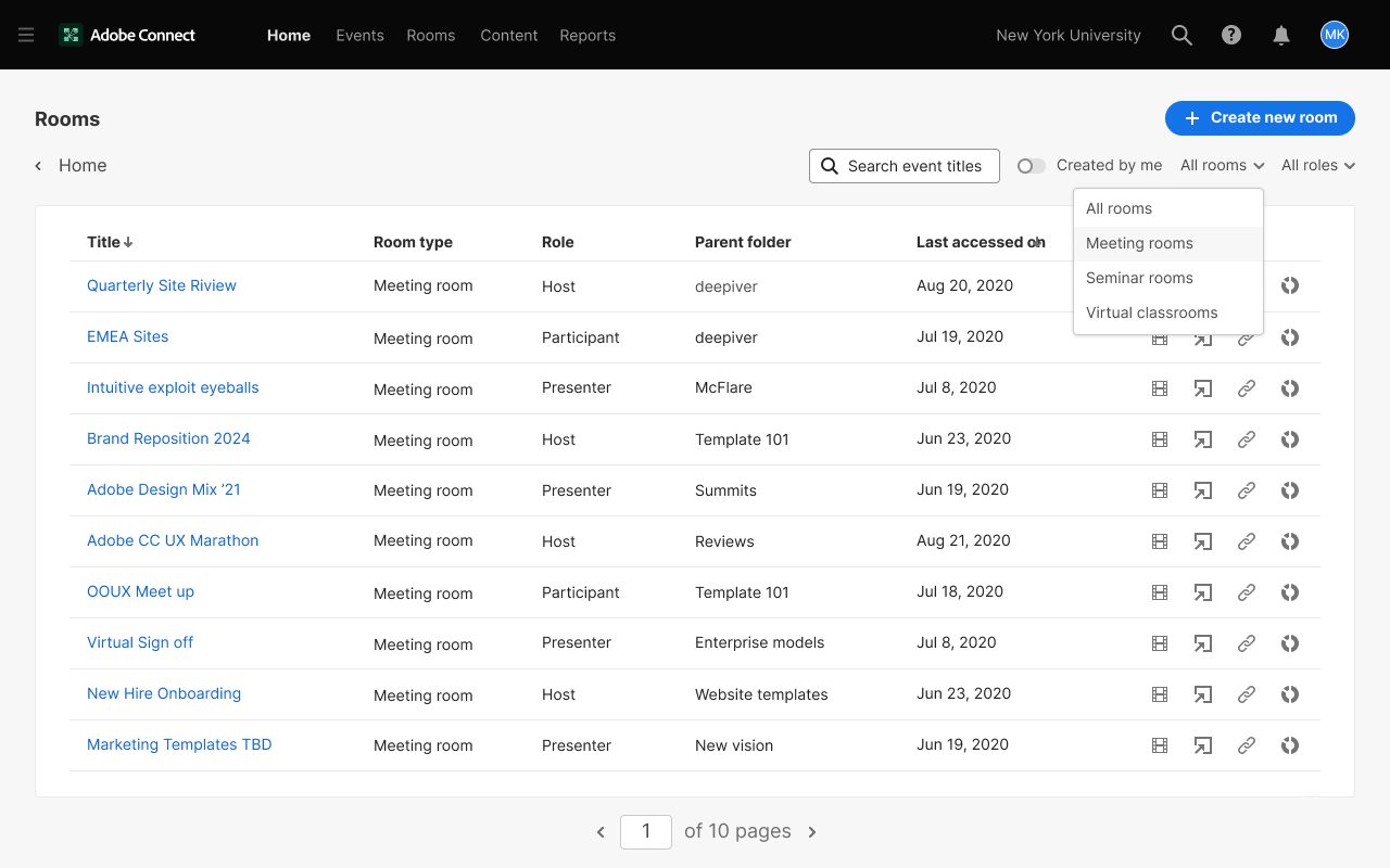
Create room - dropdown options
Options in the “Create New Room” dropdown menu.
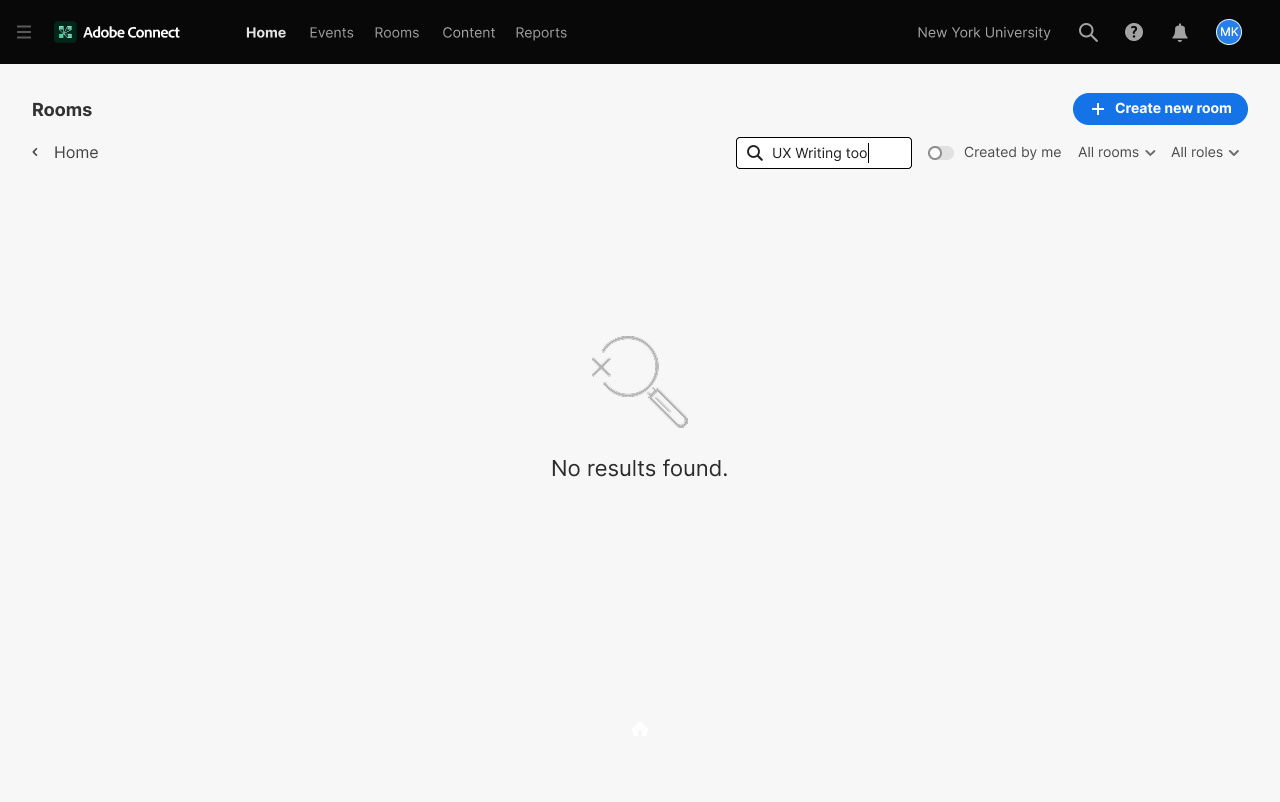
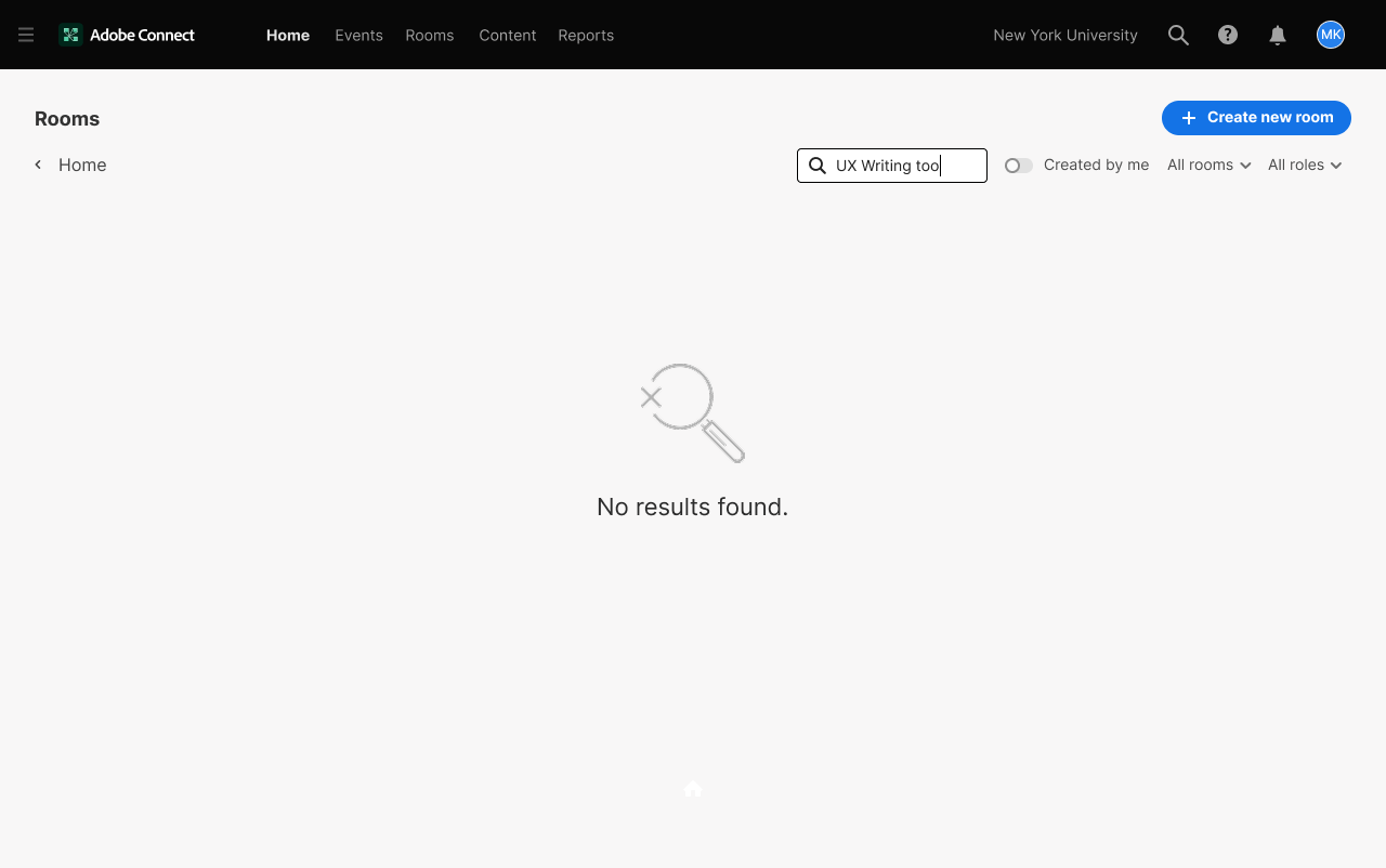
Empty search state
No results found.
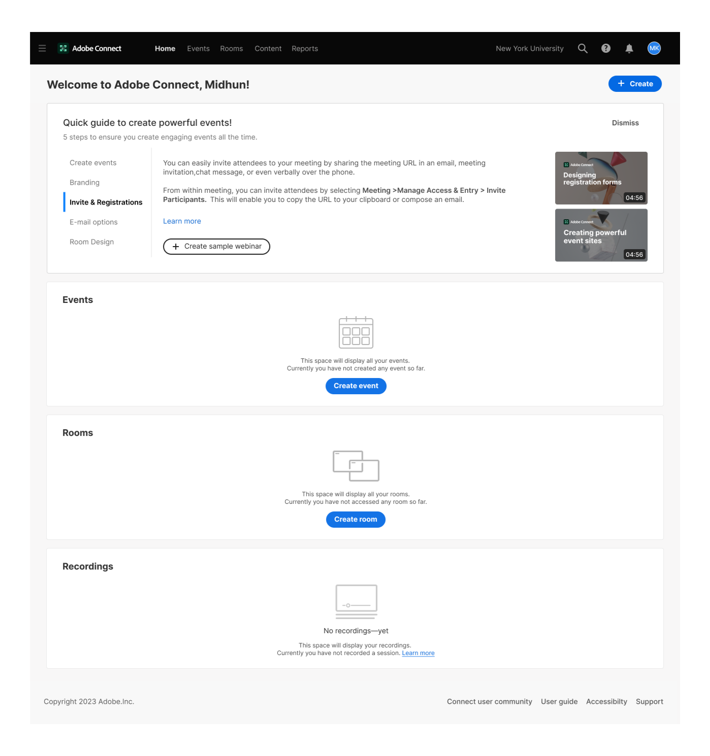
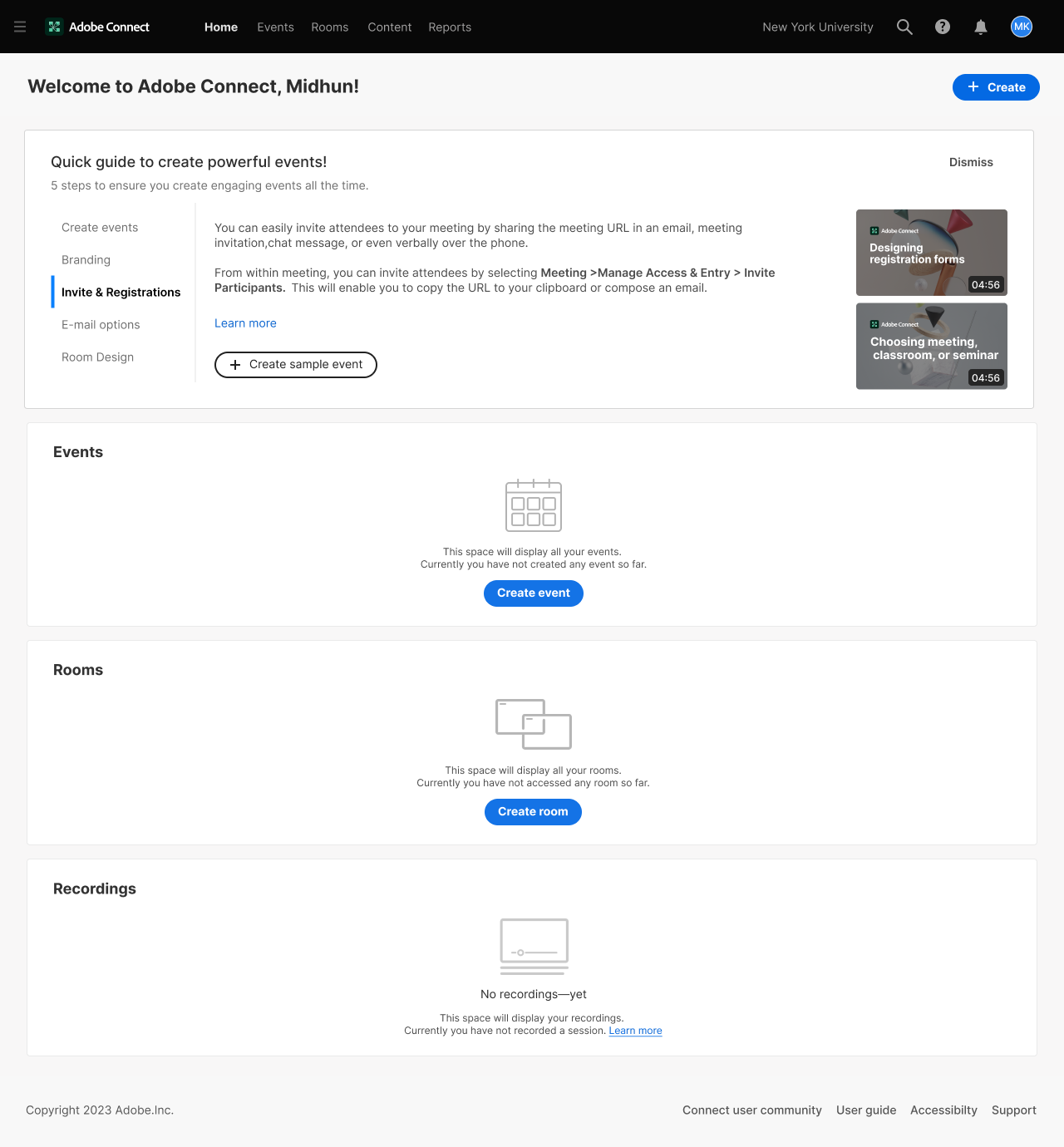
FTU - full licence, no prior activity
First-.time users with full licence access (events, rooms, and recordings) who have not yet created or engaged with any content on the platform
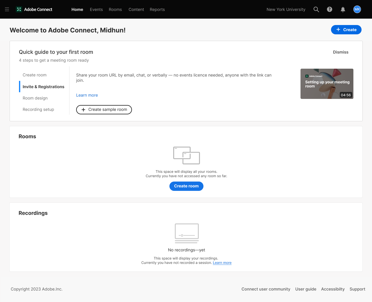
FTU - without events license, no prior activity
FTU user setting up their first room — no sessions run yet, no recordings saved, events features not available on this licence.
Experienced user without events license
Experienced rooms & recordings user — 5 or more sessions and recordings on record, no events licence.
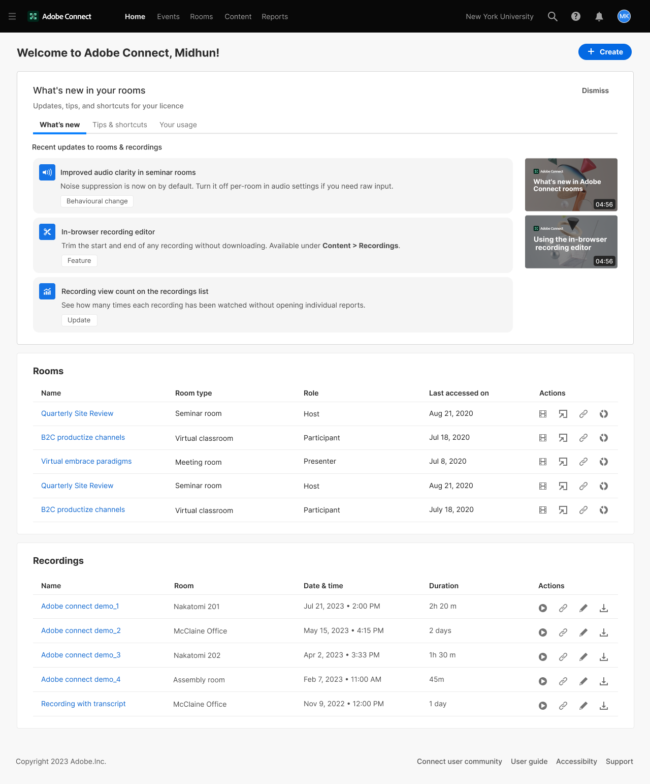
From Utility Dashboard to Experience Hub
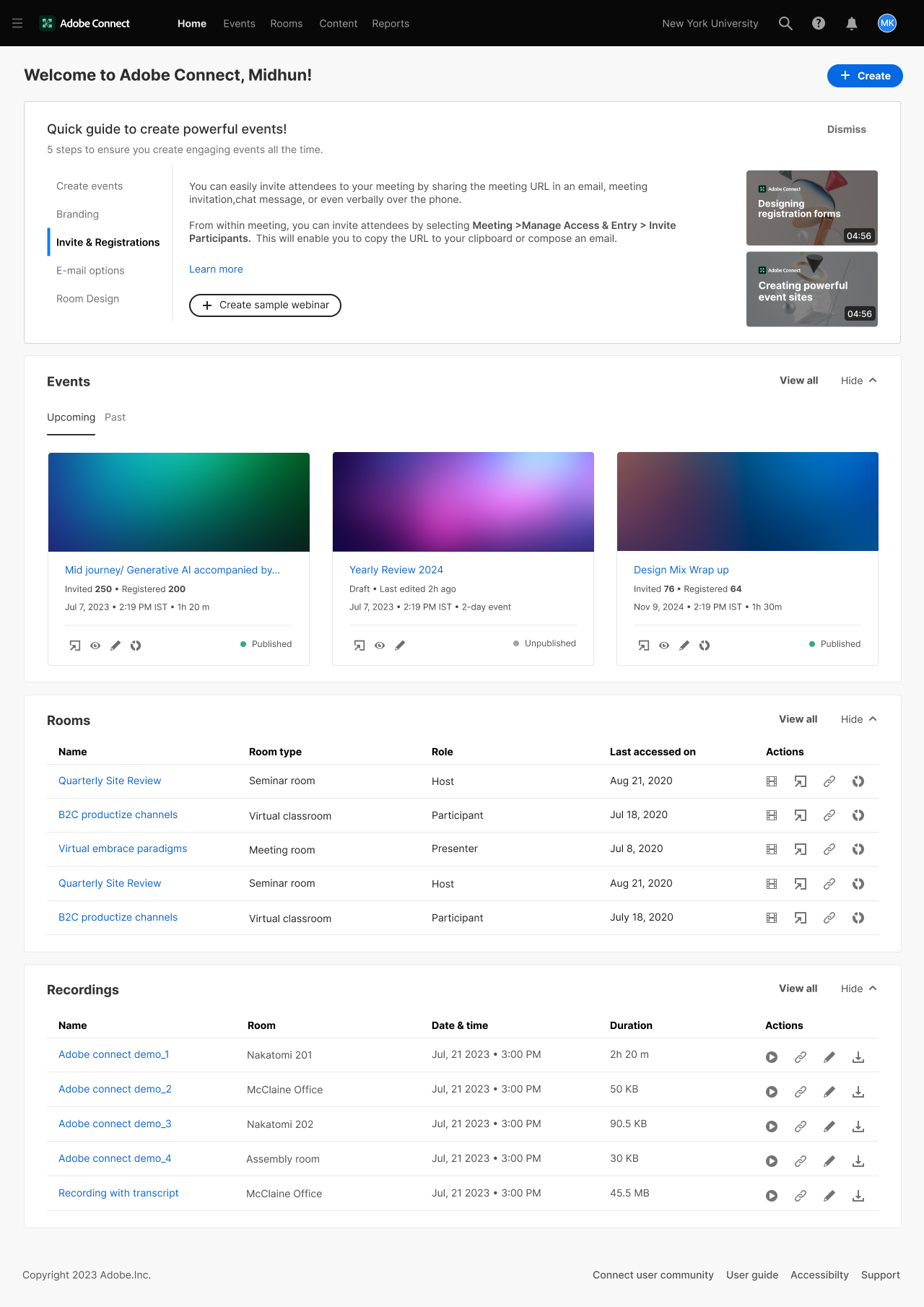
New design
V/S
Old design
Outcome
The redesign established a scalable homepage system that adapts to user context without requiring manual personalisation
Every licensed user, regardless of their activity level or access tier, lands on a homepage that reflects their state, reduces cognitive load, and surfaces a clear next action. Deliverables included use case documentation across 7 user states, widget hierarchy logic, event card variants, redlines, icon specs, and empty state designs.
Measurable Impact
35%
Reduction in cognitive load
20–30%
Improvement in time-to-task
7
User states designed
Shipped
Live for all AC users
Get to know more about Adobe Connect Central homepage