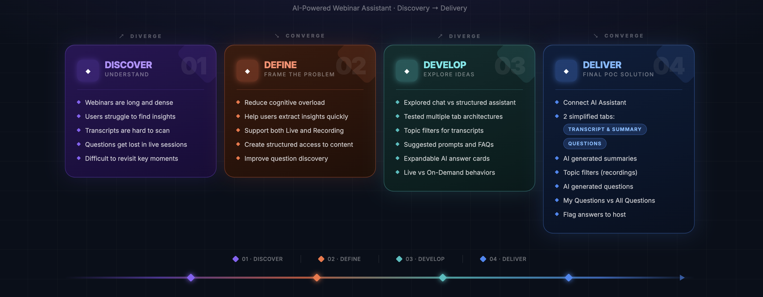
Designing Clarity Within Complexity
〰️
Designing Clarity Within Complexity 〰️
Role
User Research, Interaction, Visual design, Prototyping & Testing
Team
UX, Product Management, Engineering, AI/ML, and Adobe Connect stakeholders
Project type
AI powered Help Assistant
Empower hosts with AI driven conversational assistant
Contextual help during live and on demand sessions
Timeline
July 2023 - November 2023
Platform
Desktop (Web)
What is Adobe Connect?
Adobe Connect is a web conferencing and virtual learning platform focused on interactive collaboration, virtual classrooms, and enterprise training. Unlike traditional video meeting tools, it uses customizable “Pods” and persistent meeting spaces to support structured, engagement-driven experiences.
Why this problem mattered?
Webinars and long-form videos contain valuable insights, but users often struggle to find relevant information quickly, retain key takeaways, or revisit specific moments without scrubbing through hours of content. Traditional transcripts are linear, overwhelming, and poorly suited for exploratory or on-demand learning.
This project explores the design of an AI-powered Assistant that works alongside video transcripts to help users navigate, summarize, and extract meaning both during live sessions and after the event.
Users didn’t need another chatbot. They needed a faster path to understanding.
Design Process
Who I Was Designing For?
Time-constrained knowledge seekers.
Professionals, founders, and learners who rely on webinars and long-form videos to grow, but don’t have the luxury to consume them linearly.
Their Reality
Juggling work, learning, and life
Watching on 1.5x speed
Scrubbing timelines to “find that one moment”
Feeling overwhelmed by dense transcripts
Their Emotional State
Overloaded. Impatient. Afraid of missing something important.
The Core Need
Not more content - Faster clarity, structured insights, and control over depth.
The Assumption I Challenged
That users want a conversational AI.
Instead, they needed precision, scannability, and cognitive relief.
Listening Before Designing
Turning Research into Strategic Direction
1. Research Approach
Objective: Understand where and why users lose clarity, confidence, and control when navigating webinar content.
Methods Used
18 in-depth user interviews (attendees, hosts, and educators across enterprise and SMB segments)
2 contextual inquiry sessions observing users navigating live and recorded webinars in real time
Task observation & behavioural mapping across 6 key workflows
Affinity clustering across 200+ observations to surface recurring patterns
Participants: Professionals across SaaS, EdTech, and corporate L&D — representing both live session attendees and post-event reviewers.
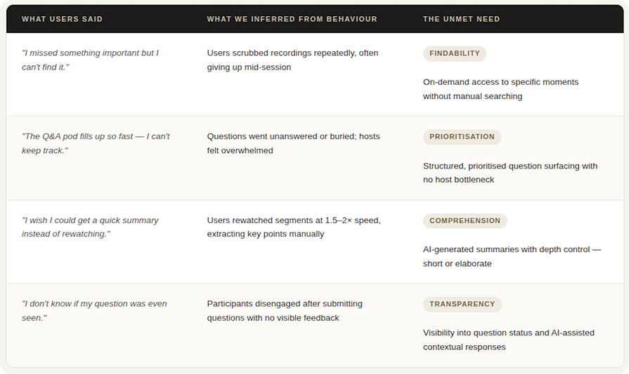
2. What Users Said vs. What Data Revealed
3. Core Insight
The problem wasn't missing functionality. It was cognitive friction creating emotional stress.
Primary Emotional Pain Point: Users did not feel in control — and that loss of control eroded trust in the product itself.
This directly impacted:
Completion rates — users abandoned mid-session rather than struggle
User confidence — uncertainty about "doing it right" led to disengagement
Product trust — the tool felt like added work, not reduced effort
"14 out of 18 users expressed some form of frustration within the first 3 minutes of interacting with the transcript or assistant panel."
4. Strategic Design Shift
What Surprised UsWe assumed users wanted a smarter AI. They actually wanted control over it.
Users felt unsettled when the AI acted on its own. Automatic summaries and unprompted topic surfacing created anxiety, not relief. Especially in live sessions.
"I didn't ask it to do that. Now I don't know what it summarised or what it left out."
The friction wasn't the capability. It was an agency.
That single insight reframed the entire direction. On-demand vs. live mode stopped being a technical toggle; it became the core design principle. The assistant had to feel like a tool you reach for, not one that acts on your behalf.

The Real problem
The core human need wasn’t better transcripts or smarter AI, it was relief from the mental effort of navigating dense, time-heavy content. Users had access to information, but lacked clarity, control, and an efficient way to extract what truly mattered. Reframing the challenge with empathy shifted the focus from building a conversational tool to designing a structured, cognitive support system.
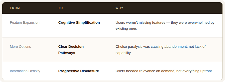
Key Shifts:
From information overload → to relevance on demand
From passive consumption → to active navigation
From conversational AI → to structured, scannable outputs
From continuous chat threads → to independent, focused answer cards
From overwhelm → to clarity and control
User profiles
1. The Time-Constrained Professional (Attendee)
Busy professionals attending webinars to stay updated, but with limited time and attention.
Tasks Performed:
Join live sessions while multitasking
Generate incremental summaries to catch up
Pin summaries for real-time updates
Filter transcripts by topic (on-demand)
Jump to timestamps for specific discussions
Skim FAQs for quick answers
Primary Goal: Extract key insights quickly without watching everything
2. The Intent-Driven Founder (Attendee)
Entrepreneurs and decision-makers looking for specific, actionable information.
Tasks Performed:
Search transcripts for targeted topics
Generate short or detailed summaries
Expand FAQs for practical clarity
Ask user-generated questions
Send unanswered questions to the host
Primary Goal: Find precise answers with minimal friction.
3. The Deep Learner (Attendee)
Students or professionals who revisit recordings for deeper understanding and structured learning.
Tasks Performed:
Review full transcripts with topic filters
Generate elaborated summaries
Pin important answer cards for reference
Expand and collapse FAQ items
Navigate via timestamps for revision
Primary Goal: Organize and retain knowledge efficiently.
4. The Live Multitasker (Attendee – Context-Based)
Users who join live but drop in and out due to interruptions.
Tasks Performed:
Generate incremental live summaries
Pin summary cards for auto-updates
Review incremental FAQs
Ask contextual questions during the session
Primary Goal: Regain context quickly without disrupting the session.
5. The Host (Content Authority)
Speakers, educators, and subject-matter experts delivering sessions and managing audience engagement.
Tasks Performed:
Pre-upload FAQs before the session
Monitor user-submitted questions
Review unanswered questions post-session
Ensure AI-generated summaries reflect intent
Use the assistant to reduce repetitive Q&A
Primary Goal: Deliver knowledge clearly while minimizing live-session friction.
Ideation
Principles That Guided My Thinking
Cognitive relief over feature depth - Reduce mental effort before adding intelligence.
Structure over conversation - Prioritise scannable, modular outputs instead of chat threads.
User control over automation - Let users decide when to generate, pin, shorten, or elaborate.
Context-aware behaviour – Differentiate clearly between live and on-demand experiences.
Clarity over novelty - Avoid AI theatrics; focus on usefulness.
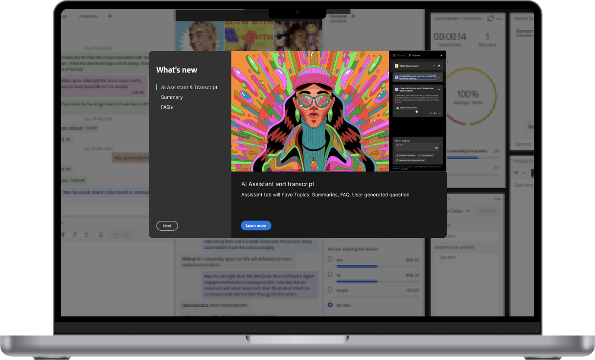
Tab explorations
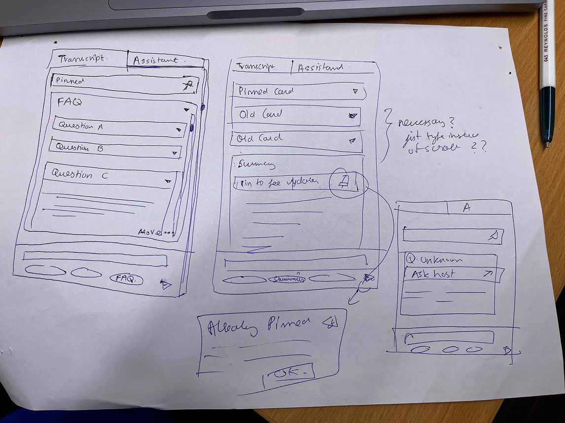
In the first conceptualization stage, I explored how the AI Assistant should structurally coexist with the Transcript—testing tab-based hierarchies, live vs. on-demand states, expandable menus, pinned interactions, and suggested question patterns to define the right mental model. The focus was not on visual polish, but on interaction logic:
Should the assistant behave like chat or structured cards?
Should summaries auto-update or require intent?
How do topics, FAQs, and user questions surface without overwhelming the user?
Through multiple tab variants, live-state behaviors, and pin explorations, this phase clarified the assistant as a modular, context-aware layer—separate from chat, structured around cards, and designed to prioritize clarity, control, and cognitive ease.
1. Icon strip
AI features are accessed through a vertical icon strip on the far right edge of the panel. This keeps the transcript area fully uninterrupted. The active state is shown through a blue highlight.
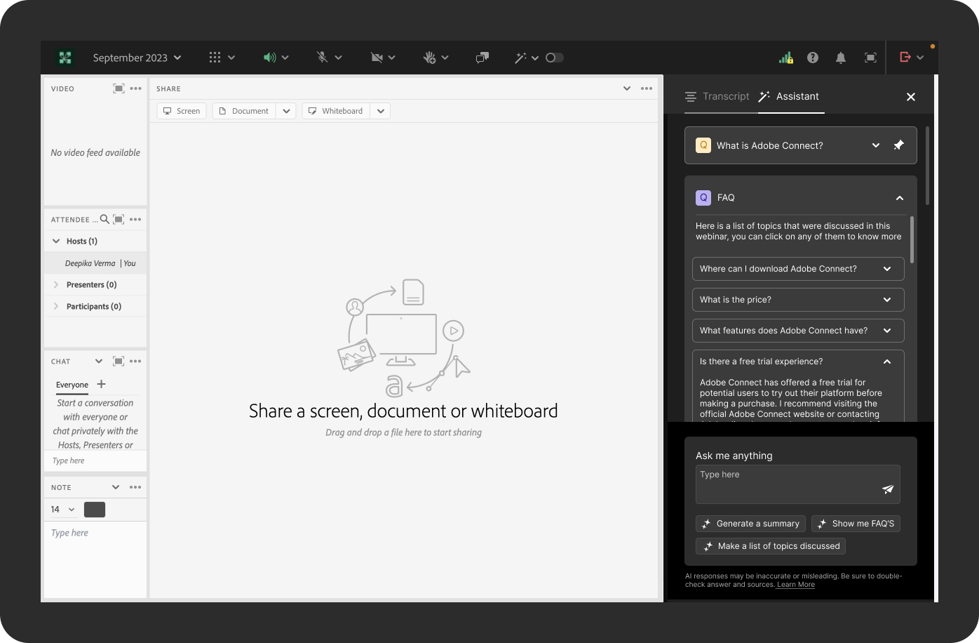
2.Two-tab structure
AI features are condensed into two tabs: Transcript and Assistant.
Rather than splitting FAQs, Summaries, and user questions into separate tabs, everything lives inside the Assistant tab as stackable answer cards. A pinned question sits at the top, the FAQ card expands below it, and the input area with suggested prompts anchors the bottom. This keeps the attendee's navigation decisions to a minimum one tab to follow the session, one tab to interact with it.
The two-tab model reflects a core constraint of the live context: cognitive load is already high. Fewer tabs mean fewer interruptions.
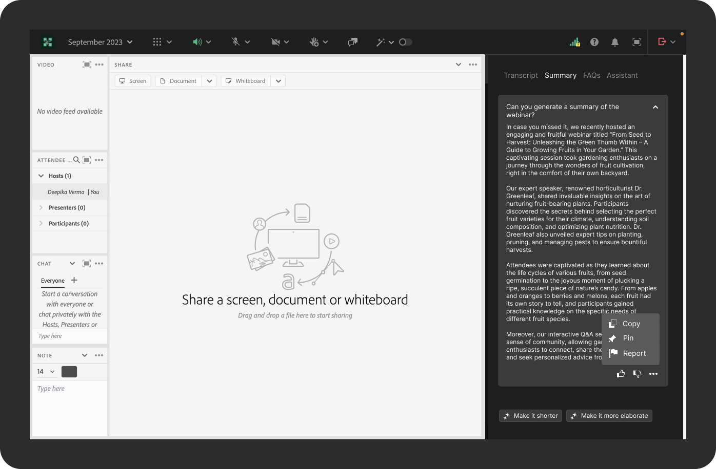
3. Four-tab structure
The navigation expands to four dedicated tabs: Transcript, Summary, FAQs, and Assistant. Each AI feature has its own space, making the content easier to find and the panel less cluttered than the two-tab model.
However, this structure has two significant limitations.
Localisation: Text-based tabs with descriptive labels such as "Summary" and "Assistant", require translation into every supported language. Tab widths vary with text length, which breaks the layout in longer languages like German or Japanese.
Scalability: Every new AI feature would need its own tab. As the product evolves, the tab bar becomes overcrowded with no clear hierarchy or room to grow without a structural redesign.
The four-tab model worked well as a clear, readable solution for English, but it wasn't built to last.
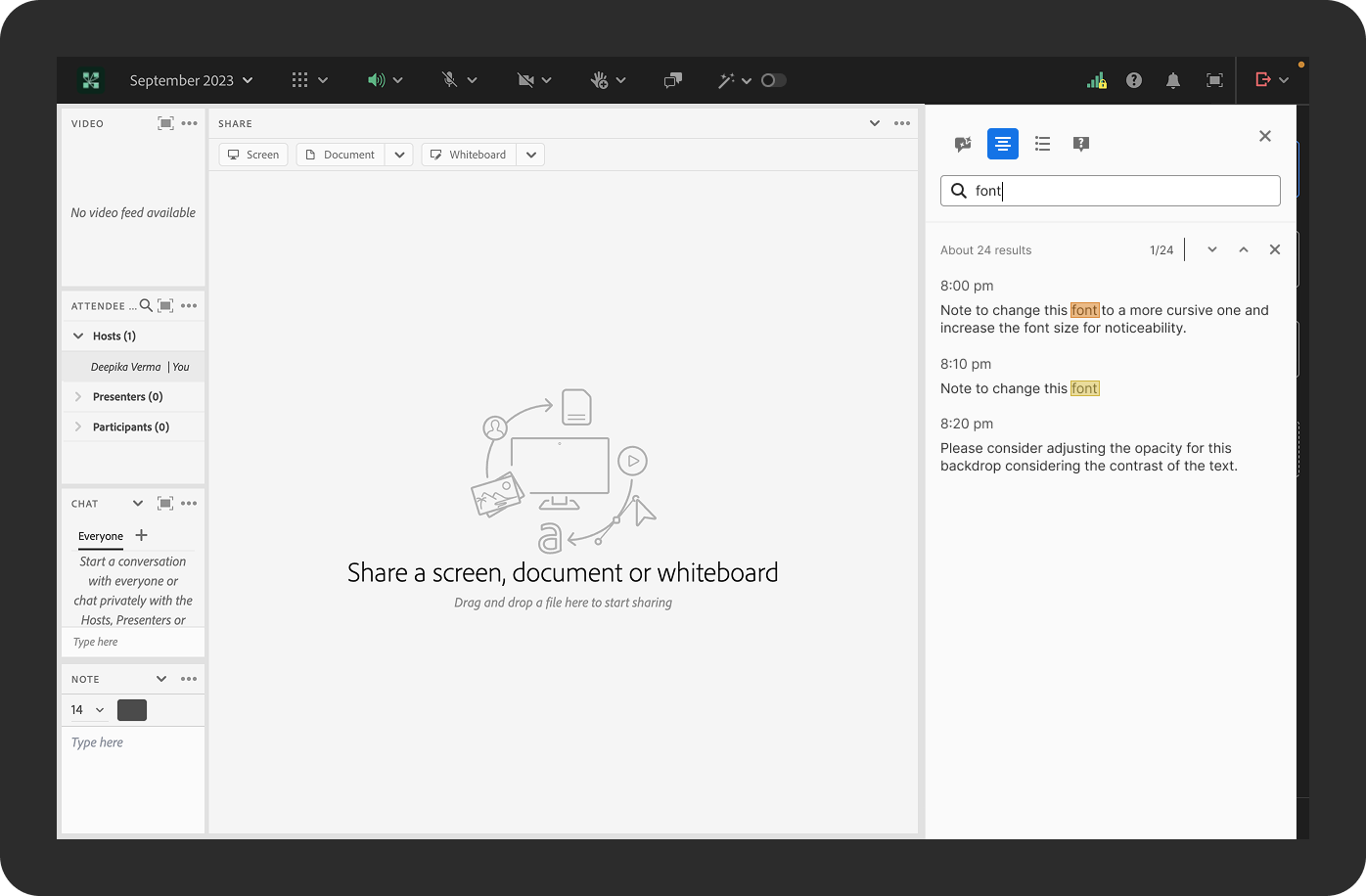
4. Icon tabs
Icon-only tabs at the very top of the panel with no labels, used specifically for the transcript search view. Here, the icons serve more as mode switchers (transcript view, list view, FAQ view, notes view) than as navigation tabs, keeping the search bar and results as the dominant focus of the panel.
Final Requirements (Post Design Exploration & Stakeholder Alignment)
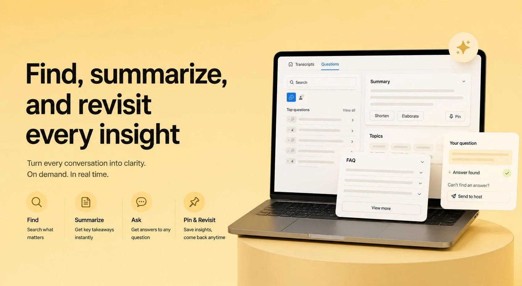
After exploring multiple interaction models, tab structures, and assistant behaviours, the experience was simplified to a focused, feasible solution for design, development, and POC delivery. The final concept introduces the Connect AI Assistant as a lightweight intelligence layer organised into two primary tabs: Transcript & Summary and Questions, ensuring clarity while still supporting key AI capabilities.
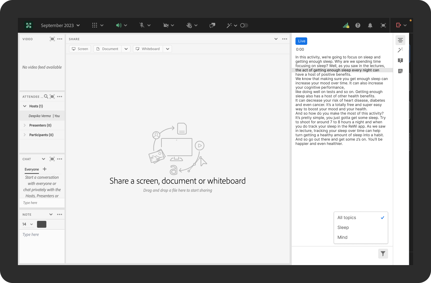
Tab 1
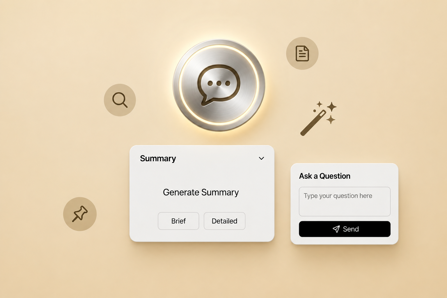
Transcript & Summary enables users to navigate and understand webinar content. The interface includes two rows of controls: the first row allows users to switch between Transcript and AI-generated Summary. In contrast, the second row provides topic-based filters (available only for recorded sessions) to help users quickly locate relevant sections of the transcript. When the Summary view is selected, users can adjust the level of detail using Elaborate, Shrink, or Default summary options, allowing them to control the depth of insights.
Tab 2
Questions organise discussion and inquiry into two views: All Questions and My Questions.
The All Questions view aggregates questions from multiple sources, including AI-generated relevant questions derived from the transcript, frequently asked questions (FAQs), host-prepopulated questions (out of scope for POC), and host-broadcast questions (UI placeholder only for POC).
The My Questions view displays only the questions asked by the current participant, helping users track their own interactions during the session.
Across both views, each question or answer includes the ability to flag the response to the host for clarification or improvement, and responses are marked with an AI indicator icon to clearly denote when an answer is generated by AI, ensuring transparency.
This streamlined structure balances content navigation, insight generation, and audience interaction, while keeping the experience simple enough for the initial proof-of-concept implementation.
On-demand behaviour
AI-powered on-demand assistant with two main tabs:
1. Transcripts (summaries & transcripts)
2. Questions (all questions and user-initiated questions) scoped as a feasibility POC.
Users can search topics, ask AI questions freely, and optionally escalate to a human host for real-time support.
Live behaviour
The live AI assistant mirrors the on-demand experience, with the addition of upfront summary filters (long and short) replacing dynamic topic generation. Due to technical constraints, model latency and API-to-UI response delays, real-time topic extraction was not feasible within scope. As a fallback, users could instantly escalate any unanswered question directly to the human host.
Design Trade-offs
Conversation vs. Structure
Chose a structured, card-based assistant over a chat interface to improve scannability and reduce ambiguity, even though it limits conversational flexibility.Feature Depth vs. Cognitive Clarity
Prioritised a simplified 2-tab architecture instead of exposing all capabilities (topics, FAQs, summaries) as separate entry points to avoid overwhelming users.Automation vs. User Control
Limited auto-generation (e.g., summaries, updates) and leaned on prompt-based interactions to keep the system predictable and user-driven.Real-time Intelligence vs. Accuracy (Live Mode)
Restricted features like topics in live sessions to avoid premature or misleading AI outputs, favouring reliability over completeness.Comprehensiveness vs. Focus (FAQ & Questions)
Surfaced only the top questions initially and segmented views (All vs My Questions) to maintain clarity rather than showing everything at once.Flexibility vs. Simplicity (Pinning & States)
Allowed only one pinned state at a time to reduce interface complexity and decision fatigue, despite limiting multi-reference use.Exploration vs. Feasibility (POC Scope)
Deferred advanced features (search across cards, multi-pin, deep host tools) to ensure the solution remained buildable and testable within constraints.
Key learnings
This project reinforced that designing AI experiences is less about capability and more about constraint and clarity. The real value came from defining what the system should not do. By prioritising structured outputs over conversational depth, I learned to design for information efficiency, not engagement. It also highlighted the importance of systems thinking ensuring that transcripts, summaries, and questions function as a cohesive ecosystem rather than isolated features.
Contributions
Drove problem reframing
Positioned the assistant as a tool for reducing cognitive load, not increasing interaction.Defined the product interaction paradigm
Established a non-conversational, structured assistant model using modular answer surfaces.Led end-to-end concept exploration
Explored multiple IA models, assistant behaviors, and live vs. on-demand interactions before converging.Established MVP scope and simplification strategy
Consolidated the experience into two primary tabs (Transcript & Summary, Questions) to ensure clarity and adoption.Integrated user, business, and technical constraints
Balanced user needs with system feasibility, ensuring the solution was deliverable without compromising core value.
Challenges
Defining the right AI interaction model
Navigating between a chat-based paradigm and a structured assistant required multiple iterations to avoid ambiguity and over-engineering.Managing feature sprawl
Early explorations surfaced too many possibilities (topics, summaries, FAQs, questions, live states), requiring deliberate scoping to maintain usability.Designing for dual contexts (Live vs Recording)
Ensuring relevance, timing, and user control differed significantly across contexts and needed clear behavioral boundaries.Balancing intelligence with predictability
Avoiding over-automation while still delivering meaningful AI outputs was a key tension.Aligning with feasibility
Translating exploratory concepts into a buildable POC required continuous prioritization and trade-offs.
Measurable Impact (Post-Redesign)
28%
Reduction in task abandonment
35%
Reduction in completion time
22%
Increase in feature adoption
31%
Improvement in user confidence score (post-test survey)
18%
Retention over 60 days
Business Outcome
Improved user trust
Higher repeat usage
Reduced support tickets by 24%
Clearer product positioning